One Y: Simple
Create a dotplot that displays the distribution of values for one variable. The worksheet must include one column of numeric or date/time data.
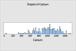
For example, in the following worksheet, Calcium contains the numeric data. The graph shows the distribution of calcium values.
| C1 |
|---|
| Calcium |
| 646.72 |
| 1120.67 |
| 1067.25 |
| ... |
For more information, go to Create a simple dotplot of one Y.
One Y: With Groups
Create a dotplot that displays the distribution of values for each group. Groups are displayed on separate panels of the same graph. The worksheet must include at least one column of numeric or date/time data and one column of categorical data. Groups are defined by values in the categorical variable, or unique combinations of values in multiple categorical variables.
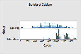
For example, in the following worksheet, Calcium contains the numeric data and Group contains the categorical data. The graph shows the distribution of calcium values for each group in a separate panel.
| C1 | C2 |
|---|---|
| Calcium | Group |
| 646.72 | Control |
| 1120.67 | Education |
| 1067.25 | Control |
| ... | ... |
For more information, go to Create a dotplot of one Y with groups.
One Y: Stack Groups
Create a dotplot that displays the distribution of values for each group. Groups are represented by different colors and symbols. The worksheet must include at least one column of numeric or date/time data and one column of categorical data. Groups are defined by values in the categorical variable, or unique combinations of values in multiple categorical variables.
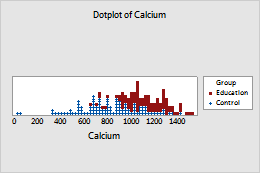
For example, in the following worksheet, Calcium contains the numeric data and Group contains the categorical data. The graph shows the distribution of calcium values for each group on the same plot.
| C1 | C2 |
|---|---|
| Calcium | Group |
| 646.72 | Control |
| 1120.67 | Education |
| 1067.25 | Control |
| ... | ... |
For more information, go to Create a dotplot of one Y with stacked groups.
Multiple Y’s: Simple
Create a dotplot that displays the distribution of values for different groups. Groups are displayed on separate panels of the same graph. The worksheet must include multiple columns of numeric or date/time data. Each column is a group.
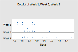
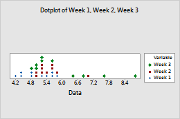
For example, the following worksheet contains the diameters of pipes produced each week for three weeks. Week 1, Week 2, and Week 3 contain the numeric data. The graph shows the distribution of pipe diameters for each week in separate panels.
| C1 | C2 | C3 |
|---|---|---|
| Week 1 | Week 2 | Week 3 |
| 5.10 | 5.57 | 8.73 |
| 5.53 | 5.11 | 5.01 |
| 4.78 | 5.76 | 7.59 |
| ... | ... | ... |
For more information, go to Create a simple dotplot of multiple Ys.
Multiple Y’s: Stack Y’s
Create a dotplot that displays the distribution of values for different groups. Groups are represented by different colors and symbols. The worksheet must include multiple columns of numeric or date/time data. Each column is a group.
For example, the following worksheet contains the diameters of pipes produced each week for three weeks. Week 1, Week 2, and Week 3 contain the numeric data. The graph shows the distribution of pipe diameters for each week on the same plot.
| C1 | C2 | C3 |
|---|---|---|
| Week 1 | Week 2 | Week 3 |
| 5.10 | 5.57 | 8.73 |
| 5.53 | 5.11 | 5.01 |
| 4.78 | 5.76 | 7.59 |
| ... | ... | ... |
For more information, go to Create a dotplot of multiple Ys, stacked.
Multiple Y’s: With Groups
Create a dotplot that displays the distribution of values for multiple-level groups. Multiple-level groups are displayed on separate panels of the same graph. The worksheet must include multiple columns of numeric or date/time data and at least one column of categorical data. Groups are defined by separate columns and by values or unique combinations of values in the categorical variables.
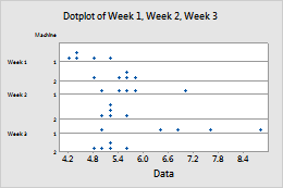
For example, the following worksheet contains the diameters of pipes produced each week for three weeks, on two machines. Week 1, Week 2, and Week 3 contain the numeric data. Machine contains the categorical data. The graph shows the distribution of pipe diameters for each week and for each machine, with each grouping combination in separate panels.
| C1 | C2 | C3 | C4 |
|---|---|---|---|
| Week 1 | Week 2 | Week 3 | Machine |
| 5.10 | 5.57 | 8.73 | 1 |
| 5.53 | 5.11 | 5.01 | 2 |
| 4.78 | 5.76 | 7.59 | 1 |
| ... | ... | ... | ... |
For more information, go to Create a dotplot of multiple Ys, with groups.
Multiple Y’s: Stack Groups
Create a dotplot that displays the distribution of values for multiple-level groups. One level of groups are displayed on separate panels of the same graph. A separate level of groups is represented by different colors and symbols. The worksheet must include multiple columns of numeric or date/time data and at least one column of categorical data. Groups are defined by separate columns and by values or unique combinations of values in the categorical variables.
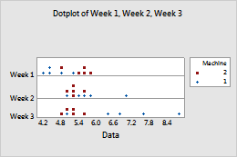
For example, the following worksheet contains the diameters of pipes produced each week for three weeks, on two machines. Week 1, Week 2, and Week 3 contain the numeric data. Machine contains the categorical data. The graph shows the distribution of pipe diameters for each week and for each machine. Each level of groups is displayed on a separate panel of the same graph. A separate level of groups is represented by different colors and symbols.
| C1 | C2 | C3 | C4 |
|---|---|---|---|
| Week 1 | Week 2 | Week 3 | Machine |
| 5.10 | 5.57 | 8.73 | 1 |
| 5.53 | 5.11 | 5.01 | 2 |
| 4.78 | 5.76 | 7.59 | 1 |
| ... | ... | ... | ... |
For more information, go to Create a dotplot of multiple Ys, with stacked groups.