This topic is about the scales on a 3D plot, such as the axes on a 3D scatterplot. For information on other scale types, click one of the following links.
When you plot two variables in Minitab, you usually display the y variable on the vertical or y-axis to represent the response and the x variable on the horizontal or x-axis to represent the predictor. When you plot variables in three dimensions, the x and y variables usually represent the predictor variables and the z variable usually represents the response.
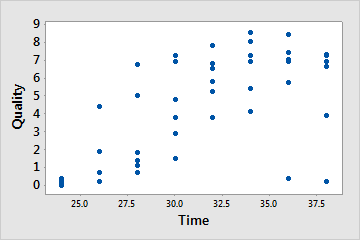
Scatterplot with x and y scales
This scatterplot shows how reheat time (x) affects the quality (y) of a frozen entree.
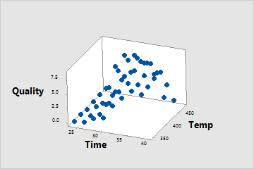
3D scatterplot with x, y, and z scales
This 3D scatterplot shows how both temperature (x) and reheat time (y) affect the quality (z) of a frozen entree.
Show or hide scale elements
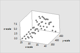
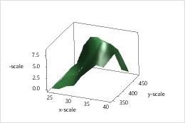
Graph scale elements are axis lines, axis labels, tick marks, and tick labels. You can display these elements on the x-, y-, and z-scales of the graph. For example, on the following graphs, the axis line, major tick marks, and tick labels are displayed on all three axes.
3D scatterplot
3D surface plot
To specify which elements to include when you create a graph, use the following steps:
Click Scale.
On the Axes and Ticks tab, select the elements to show.
To change or add the elements on an existing graph, use the following steps:
Double-click the graph.
Double-click the scale to open the Edit
Scale dialog box.
On the Show tab, select the elements to show.
Change the position of the major tick marks
When you create a graph, Minitab sets the tick mark positions to fit the scale. To change the major tick mark positions on an existing graph, use the following steps:
Double-click the graph.
Double-click the scale to open the Edit
Scale dialog box.
On the Scale tab, under Major Tick Positions, specify one of the following:
Automatic: Display the tick marks in their default positions.
Number of ticks: Enter the number of tick marks. Minitab spaces the tick marks evenly along the axis line. (Not available for all graphs.)
Position of ticks: Enter the scale values at which you want major tick marks to appear. You can enter a series of numbers or specify a range of values. Use a colon between two numbers to indicate the range. Use a slash after the range to indicate an increment amount. For example, 5:30/5 places tick marks at 5, 10, 15, 20, 25, and 30.
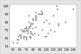
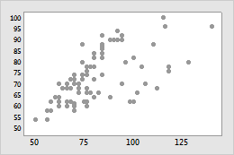
For example, the following scatterplots illustrate the same data. One plot shows the default tick mark positions and the other plot uses custom tick mark positions.
Default tick mark positions
Custom tick mark positions
Change the scale range
Minitab sets the scale range so that the observations extend the length of the axis. To compress or expand the display of observations on the axis, use the following steps:
Double-click the graph.
Double-click the scale to open the Edit
Scale dialog box.
On the Scale tab, under Scale Range, deselect Auto for Minimum or Maximum, then enter the new minimum or maximum.
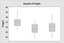
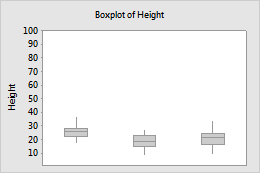
For example, the following boxplots are of the same data, but the y-scale ranges are different.
Default y-scale range
Custom y-scale range
Change the number of minor tick marks
To change the number of minor tick marks that appear between two major tick marks, use the following steps:
Double-click the graph.
Double-click the scale to open the Edit
Scale dialog box.
On the Scale tab, deselect Auto, then enter a number.
1 minor tick mark
4 minor tick marks
Note
For minor tick marks to appear on the graph, you must select them on the Show tab.
Change the axis line attributes
To change the color, size, and line type of the axis lines and tick marks, use the following steps:
Double-click the graph.
Double-click the scale to open the Edit
Scale dialog box.
On the Attributes tab, specify the options.
Change the font of the tick mark labels
To change the font for the tick mark labels, use the following steps:
Double-click the graph.
Double-click the scale to open the Edit
Scale dialog box.
On the Font tab, specify the options.
Change the font and text of the axis labels
To edit an axis label, use the following steps:
Double-click the graph.
Double-click the axis label to open the Edit Axis
Label dialog box.