A chemical engineer assesses the quality of the plastic that is used in manufacturing billiard balls. Because higher elasticity is better, the engineer wants to determine whether either of two additives improves the elasticity of the plastic. The engineer prepares 10 samples with each of the two additives and 10 samples with no additive and measures the elasticity of each.
As part of the initial investigation, the engineer creates a dotplot to compare the elasticity of the samples.
- Open the sample data, BilliardBallElasticity.MTW.
- Choose .
- In Graph variables, enter Elastic.
- In Categorical variables for grouping (1-4, outermost first), enter Additive.
- Click OK.
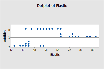
Interpret the results
Additive 1 appears to increase elasticity. Additive 2 may actually decrease elasticity. For samples that have no additive (0), the elasticity appears to be between additives 1 and 2. The variation within each group appears to be about the same.