Step 1: Examine the variation in your data
Use a multi-vari chart as a preliminary tool to investigate variation in your data, including cyclical variations and interactions between factors.
The multi-vari chart displays the means at each factor level for every factor. In Minitab, each multi-vari chart can display up to four factors. Minitab uses a different color to show the means and connect lines for each factor.
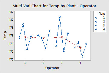
This chart indicates a pattern in the mean temperatures at the different plants across the operators. For most operators (1, 3 and 4), the mean temperature is highest at level 2 of the Plant factor. For all operators, the lowest mean temperature is at level 3. Also, the mean connect line shows that the mean of operator 4 appears to be lower than the mean of the other three operators.
Step 2: Look for interactions
Multi-vari charts are often used to identify interactions. An interaction occurs when the change in response from one level of a factor to another level depends upon the level of another factor.
For example, suppose a manufacturer produces plastic pipes on two different machines that have three different temperature settings. An interaction between machine and temperature may exist if, for instance, the pipe diameters vary across the temperature settings differently on one machine than the other.
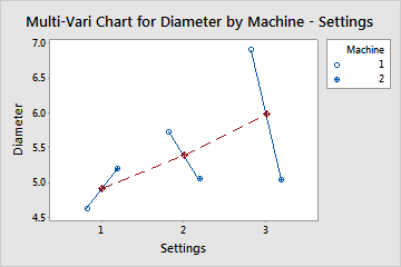
The multi-vari chart indicates a possible interaction between the machine and the temperature settings. A larger diameter is found on Machine 1 at Settings 2 and 3, but a smaller diameter is found on Machine 1 at Setting 1. The data show that the diameters vary differently across temperature settings for different machines, indicating an interaction.