In This Topic
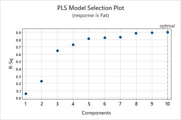
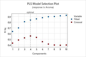
Model selection plot
The model selection plot is a scatterplot of the R2 and predicted R2 values as a function of the number of components that are fit or cross-validated. It is a graphical display of the Model Selection and Validation table. If you do not use cross-validation, the predicted R2 values do not appear on your plot. Minitab provides one model selection plot per response.
Interpretation
Use this plot to compare the modeling and predicting power of different models to determine the appropriate number of components to retain in your model. The vertical line on the plot indicates the number of components Minitab selected for the PLS model.
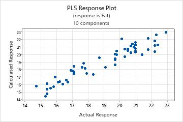
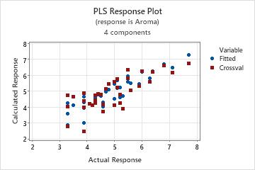
Response plot
The response plot is a scatterplot of the fitted values versus the actual responses. If you perform cross-validation, the plot also includes the fitted values versus the cross-validated fitted values. Minitab provides one response plot per response.
Interpretation
- A nonlinear pattern in the points, which indicates the model may not fit or predict data well.
- If you perform cross-validation, large differences in the fitted and the cross-validated values, which indicate a leverage point.
A model with excellent predictive capability usually has a slope of 1 and intersects the y-axis at 0.
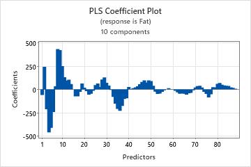
Coefficient plot
The coefficient plot is a projected scatterplot showing the unstandardized coefficients for each predictor. Minitab provides one coefficient plot per response.
Interpretation
Use the coefficient plot, along with the output of regression coefficients to compare the sign and magnitude of the coefficients for each predictor. The plot makes it easier to quickly identify predictors that are more or less important in the model.
Because the plot displays unstandardized coefficients, you can only make comparisons among the magnitude of the relationships between predictors and the response if your predictors are on the same scale (for example, spectral data). Otherwise, use the standardized coefficient plot or use the loading plot to compare the weights of predictors used to calculate the components.
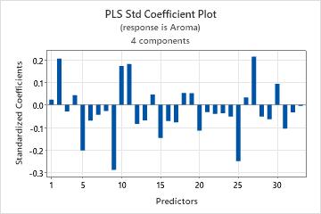
Std coefficient plot
The coefficient plot is a projected scatterplot showing the standardized coefficients for each predictor. Minitab provides one standardized coefficient plot per response.
Interpretation
Use this plot, along with the output of regression coefficients to compare the sign and magnitude of the coefficients for each predictor. The plot makes it easier to quickly identify predictors that are more or less important in the model.
Because the plot displays standardized coefficients, you can make comparisons among the magnitude of the relationships between predictors and the response even if your predictors are not on the same scale.
If your predictors are on the same scale, the pattern of coefficients in standardized and unstandardized plots look similar. These plots may not look identical, though, because the predictors are highly correlated, causing the coefficients to be unstable and because of differences between sample standard deviations and population standard deviations.
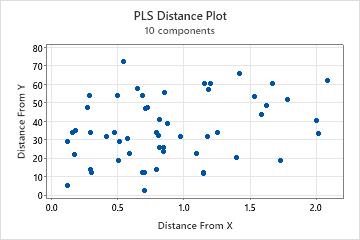
Distance plot
The distance plot is a scatterplot of each observation's distance from the x- and y-model. Distances from the y-model measure how well an observation is fitted in the y-space. Distances from the x-model measure how well an observation is fitted in the x-space.
Interpretation
When examining this plot, look for points with distances greater than other points on the x- or y-axis. Observations with greater distances from the y-model may be outliers and observations with greater distances from the x-model may be leverage points.
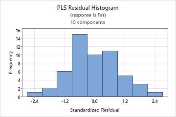
Histogram of residuals
The histogram of the standardized residuals shows the distribution of the standardized residuals for all observations.
Interpretation
| Pattern | What the pattern may indicate |
|---|---|
| A long tail in one direction | Skewness |
| A bar that is far away from the other bars | An outlier |
Because the appearance of a histogram depends on the number of intervals used to group the data, don't use a histogram to assess the normality of the residuals. Instead, use a normal probability plot. A histogram is most effective when you have approximately 20 or more data points. If the sample is too small, then each bar on the histogram does not contain enough data points to reliably show skewness or outliers.
Normal probability plot of residuals
The normal probability plot of the residuals displays the standardized residuals versus their expected values when the distribution is normal.
Interpretation
Use the normal probability plot of the residuals to verify the assumption that the residuals are normally distributed. The normal probability plot of the residuals should approximately follow a straight line.
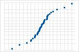
S-curve implies a distribution with long tails.

Inverted S-curve implies a distribution with short tails.
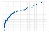
Downward curve implies a right-skewed distribution.
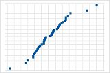
A few points lying away from the line implies a distribution with outliers.
If you see a nonnormal pattern, use the other residual plots to check for other problems with the model, such as missing terms or a time order effect. If the residuals do not follow a normal distribution, the confidence intervals and p-values can be inaccurate.
Residuals versus fits
The residuals versus fits graph plots the standardized residuals on the y-axis and the fitted values on the x-axis.
Interpretation
Use the residuals versus fits plot to verify the assumption that the residuals are randomly distributed and have constant variance. Ideally, the points should fall randomly on both sides of 0, with no recognizable patterns in the points.
| Pattern | What the pattern may indicate |
|---|---|
| Fanning or uneven spreading of residuals across fitted values | Nonconstant variance |
| Curvilinear | A missing higher-order term |
| A point that is far away from zero | An outlier |
| A point that is far away from the other points in the x-direction | An influential point |
Plot with outlier
One of the points is much larger than all of the other points. Therefore, the point is an outlier. If there are too many outliers, the model may not be acceptable. You should try to identify the cause of any outlier. Correct any data entry or measurement errors. Consider removing data values that are associated with abnormal, one-time events (special causes). Then, repeat the analysis.
Plot with nonconstant variance
The variance of the residuals increases with the fitted values. Notice that, as the value of the fits increases, the scatter among the residuals widens. This pattern indicates that the variances of the residuals are unequal (nonconstant).
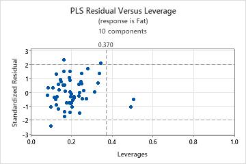
Residual versus leverage plot
The residual versus leverage plot is a scatterplot of the standardized residuals versus the leverage of each observations.
Interpretation
- Outliers: Observations with standardized residuals greater than +/- 2, which lie outside the horizontal reference lines on the plot.
- Leverage points: Observations with leverage values greater than 2m / n, where m = the number of components and n = the number of observations, which are considered extreme. They have x-scores far from zero and are to the right of the vertical reference line, which is located at the value 2m / n on the x-axis. If 2m / n is greater than one, the reference line doesn't appear on your plot because leverage values are always between 0 and 1.
Residuals versus order
The residuals versus order plot displays the standardized residuals in the order that the data were collected.
Interpretation
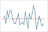
Trend
Shift
Cycle
Score plot
The score plot is a scatterplot of the x-scores from the first and second components in the model.
Interpretation
If the first two components explain most of the variance in the predictors, then the configuration of the points on this plot closely reflects the original multidimensional configuration of your data. To check how much variance in the predictors the model explains, examine the x-variance values in the Model Selection and Validation table. If the x-variance value is high, then the model explains significance variance in the predictors.
- Leverage points: Points that lie far from the majority of points on the plot may be leverage points and could have a significant effect on the results.
- Clusters: Points that group together may indicate two or more separate distributions in your data, which may be described better by different models.
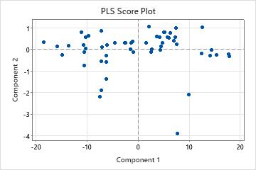
Note
If your model contains more than 2 components, you may want to plot the x-scores of other components using a Scatterplot. To do this, store the x-score matrix and then copy the matrix into columns using . If your model has only one component, this plot does not appear in your output.
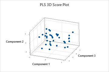
3D score plot
The 3D score plot is a three-dimensional scatterplot of the x-scores from the first, second, and third components in the model. If the first three components explain most of the variance in the predictors, then the configuration of the points on this plot closely reflects the original multidimensional configuration of your data. To check how much variance the model explains, examine the x-variance values in the Model Selection and Validation table. If the x-variance value is high, then the model explains significance variance in the predictors.
Interpretation
- Leverage points: Points that lie far from the majority of points on the plot may be leverage points and could have a significant effect on the results.
- Clusters: Points that group together may indicate two or more separate distributions in your data, which may be described better by different models.
You should also use the 3D graph tools, which allow you to rotate the plot so you can view it from different perspectives. This will give you a more complete picture of your data and allow you to more accurately identify leverage points and clusters of points.
Loading plot
The loading plot is a scatterplot of the predictors projected onto the first and second components in the model. It shows the x-loadings for the second component plotted against the x-loadings of the first component. Each point, representing a predictor, is connected to (0,0) on the plot.
Interpretation
The loading plot shows how important the predictors are to the first two components and is particularly useful when your predictors are on different scales. If the components explain most of the x-variance, which is shown in the Model Selection and Validation table, then the loading plot indicates how important the predictors are in the x-space. When considering the importance of the predictors in the entire model, you must also consider how much variance the components explain in the responses. To check this, examine the R2 and predicted R2 values in the Model Selection and Validation table.
- Angles between the lines, which represent the correlation between the predictors. Smaller angles indicate predictors are highly correlated.
- Predictors with longer lines, which have greater loadings in the first or second components and are more important in the model.
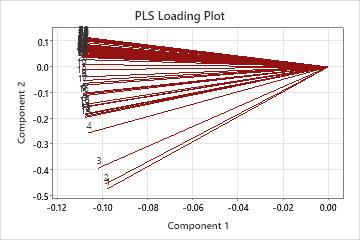
Note
If your model contains more than 2 components, you may want to plot the x-loadings of other components using a Scatterplot. To do this, store the x-loading matrix and then copy the matrix into columns using .
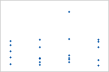
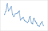
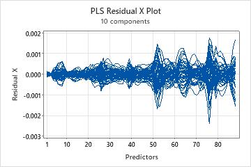
Residual X plot
The residual X plot is a line plot of the x-residuals versus the predictors. Each line represents an observation and has as many points as it has predictors.
Interpretation
Use the x-residual matrix plot to identify observations or predictors that the model describes poorly. This plot is most useful with predictors that are on the same scale.
- When the lines are spaced apart at the same point on the x-axis, the model poorly describes the predictor at that point.
- When a line on the plot deviates from the other lines, the model poorly describes the observation represented by that line.
Use the x-residual matrix plot to examine general patterns in the residuals and identify areas where problems exist. Then, examine the x-residuals displayed in the output to determine which observations and predictors the model describes poorly.
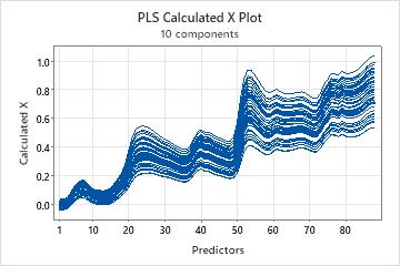
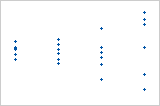
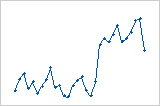
Calculated X plot
The calculated X plot is a line plot of the x-calculated values versus the predictors. Each line represents an observation and has as many points as it has predictors.
Interpretation
Use this plot to identify observations or predictors that the model describes poorly. This plot is most useful with predictors that are on the same scale.
The calculated X plot complements the x-residual plot. The sum of both plots results in a plot of the original predictor values. A predictor with x-calculated values that are much smaller or larger than the original x-values is not well described by the model.