Researchers in a food laboratory want to enhance a recipe for cheese fondue by improving the flavor, maximizing the amount that sticks to bread dipped into the fondue, and minimizing the amount that is burned at the bottom of the pot. The researchers design an extreme vertices mixture experiment to study the effects of the mixture blend and serving temperature.
The researchers fit the models for all the response variables and use an overlaid contour plot to find predictor settings that produce acceptable values for the three responses: Flavor, Quantity, and Burned.
- Open the sample data, FondueRecipe_model.MTW.
- Choose .
- Under Responses, move Flavor, Quantity and Burned from the Available list to the Selected list.
- Under Select components or process variables as axes, select 3 Components.
- Under X-Axis, choose Emmenthaler. Under Y-Axis, choose Gruyere. Under Z-Axis, choose Broth.
- Click Contours.
- Complete the Low and High columns of the table as shown below.
Low High Flavor 80 100 Quantity 1.5 3 Burned 0 1.5 - Click OK in each dialog box.
Interpret the results
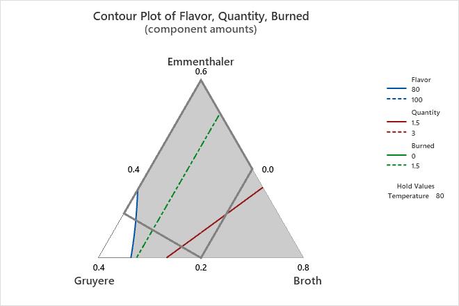
For the fondue data, Minitab uses the fitted response variables to create the overlaid contour plot. The white area in the plot displays the combination of proportions for Emmenthaler, Gruyere, and Broth that yield satisfactory fitted values for the response variables of Flavor, Quantity, and Burned. The process variable, Temperature, is not displayed in the plot. Minitab holds the temperature constant at 80 to calculate the fitted response values. You can try other holding values to see the plot change.
The solid grey contour represents the design space for this mixture design. Use caution because the white feasible region extends outside of the design space. Generally, you should use proportions that are in the design space because the relationships between the variables are uncertain outside of the design space.
You can use overlaid contour plots in combination with the Response Optimizer to find the best proportions for the ingredients and the best temperature.
Tip
To annotate the values of the predictors and the responses for any point on this plot, use Plant Flag. To plant a flag, right-click the plot, choose Plant Flag in the menu that appears, and then click the point on the plot that you want to annotate.