Use a contour plot to see how fitted response values relate to two continuous variables based on a model equation. A contour plot provides a two-dimensional view in which all points that have the same response are connected to produce contour lines of constant responses. Contour plots are useful for establishing desirable response values and operating conditions.
- Predictors on the x- and y-axes.
- Contour lines that connect points that have the same fitted response value.
- Colored contour bands that represent ranges of the fitted response values.
- Means for response variables that contain continuous measurements, such as length or weight.
- Means for response variables that contain counts that follow the Poisson distribution, such as the number of defects per sample.
- Probabilities for response variables that contain only two possible outcomes, such as pass/fail.
- Standard deviations for models that are fit using Analyze Variability.
A contour plot can include only two continuous variables. If a model has more than two continuous variables, then Minitab holds each variable that is not on the plot constant. If a model has categorical variables, then Minitab also holds the categorical variables constant. Thus, these plots are valid only for fixed levels of the extra variables. If you change the holding levels, the contours also change, sometimes drastically.
Contour plots do not use the data in the worksheet. Instead, Minitab estimates the contours based on a stored model. The accuracy of the contour plot depends on how well the model represents the true relationships between the variables.
For more information about how to interpret the results for a mixture design, go to Example of Contour Plot with a mixture design.
Tip
To annotate the values of the predictors and the responses for any point on this plot, use Plant Flag. To plant a flag, right-click the plot, choose Plant Flag in the menu that appears, and then click the point on the plot that you want to annotate. Use Predict to determine whether these points are unusual and to assess the precision of the predictions.
Key Results: Contour Plot
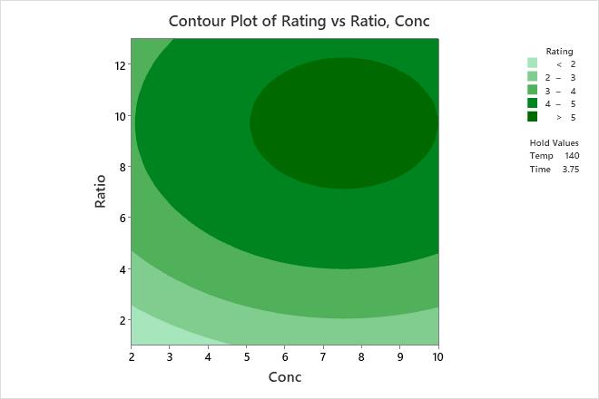
The contours are curved because the model contains quadratic terms that are statistically significant.
The highest values of rating for wrinkle resistance of cotton cloth are in the upper right corner of the plot, which corresponds with high values of both formaldehyde concentration (Conc) and catalyst ratio (Ratio).
The lowest values of rating for wrinkle resistance are in the lower left corner of the plot, which corresponds with low values of both Conc and Ratio.
The third and fourth predictors, curing temperature (Temp) and Time, are not displayed in the plot. Minitab holds the values of Temp constant at 140 and Time at 3.75 when calculating the fitted response values for wrinkle resistance.