Researchers in a food laboratory want to enhance a recipe for cheese fondue by improving the flavor, maximizing the amount that sticks to bread dipped into the fondue, and minimizing the amount that is burned at the bottom of the pot. The researchers design an extreme vertices mixture experiment to study the effects of the mixture blend and serving temperature.
The researchers fit the model for the mixture design and use a contour plot to illustrate the relationship between the fitted values of flavor and the amounts of Emmenthaler, Gruyere, and broth.
- Open the sample data, FondueRecipe_model.MTW.
- Choose .
- Select Contour plot and then click the corresponding Setup button.
- From Response, select Flavor.
- Under Components or Process Variables, select Select a triplet of components for a single plot. Under X-Axis, choose Emmenthaler. Under Y-Axis, choose Gruyere. Under Z-Axis, choose Broth.
- Select Plot all level combinations.
- Click OK in each dialog box.
Interpret the results
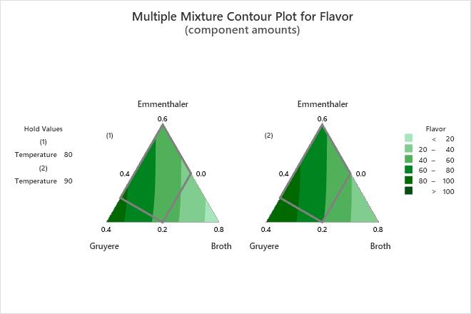
For the fondue data, both plots show how the component proportions are related to the flavor of the fondue. To maximize flavor, the researchers should choose proportions for the components in the lower left corner of the design space where the flavor ratings are the highest. In both plots, the darkest green contour is the highest in the design space.
Compare the plots where serving temperature is 80 degrees versus 90 degrees to see which level of the process variable results in better flavor. The flavor ratings in the lower left corner of the design space are higher when the serving temperature is 90 than when it is 80.
The proportions of the components must be selected in such a manner that they sum to one. The solid grey contour represents the design space for this mixture design. For an extreme vertices design, the plot can extend beyond the design space, which occurs in this example. Generally, you should use proportions that are in the design space because the relationships between the variables are uncertain outside of the design space.
Tip
To annotate the values of the predictors and the responses for any point on this plot, use Plant Flag. To plant a flag, right-click the plot, choose Plant Flag in the menu that appears, and then click the point on the plot that you want to annotate. Choose to determine whether these points are unusual and to assess the precision of the predictions.