Step 1: Compare groups
Look for differences in the heights of the bars. The bars show the values for the groups. Refer to the scale range of the y-axis to determine the actual differences between groups.
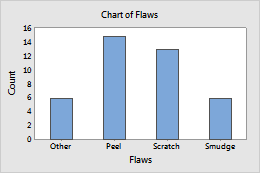
For example, this bar chart compares the counts of different types of paint flaws. Peels are the most common, followed by Scratches, Smudges, and Other. The counts range from about 6 to 15.
Tip
In Minitab, hold the pointer over a bar to view a tooltip that shows the value of the bar.
Step 2: Compare groups within groups
Compare bars within the clusters or stacks to understand the proportions of subcategories within each main group. Compare bars from the same subcategory across clusters or stacks.
Clustered
Stacked
If you have more than one categorical variable, you can create a different view of the groups by switching the order of the variables in the dialog box.
- Clustered
-
The categorical variable that you enter first in the dialog box is the outermost variable on the scale.
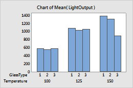
For example, these bar charts show mean light output for each combination of glass type and temperature. When temperature is the outermost variable, you can more easily see that glass type does not appear to affect light output, unless the temperature setting is 150.
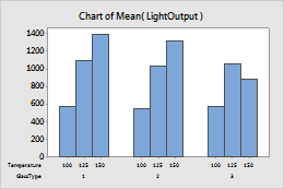
GlassType is outermost
Temperature is outermost
- Stacked
-
The categorical variable that you enter last in the dialog box is the stacked variable.
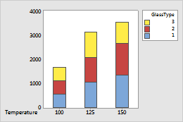
For example, these bar charts show mean light output for each combination of glass type and temperature. When glass type is the stacked variable, you can more easily see that the glass type produces greater differences in light output than temperature.
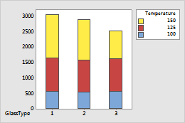
Temperature is stacked
GlassType is stacked