In This Topic
Step 1: Describe the center of your data
Use the mean to describe the sample with a single value that represents the center of the data. Many statistical analyses use the mean as a standard measure of the center of the distribution of the data.
The median is another measure of the center of the distribution of the data. The median is usually less influenced by outliers than the mean. Half the data values are greater than the median value, and half the data values are less than the median value.
Symmetric
Not symmetric
For the symmetric distribution, the mean (blue line) and median (orange line) are so similar that you can't easily see both lines. But the non-symmetric distribution is skewed to the right.
Key Results: Mean and Median
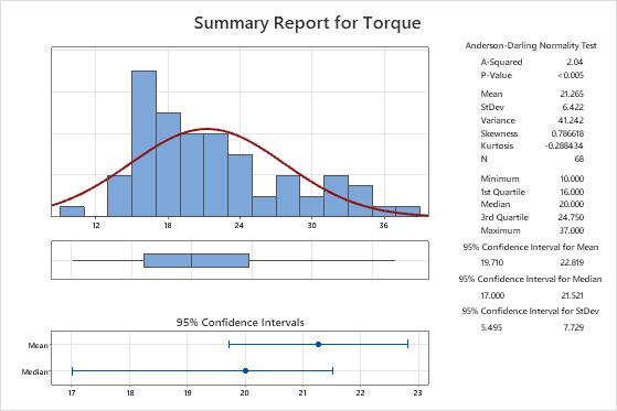
In these results, the mean torque that is required to remove a toothpaste cap is 21.265, and the median torque is 20. The data appear to be skewed to the right, which explains why the mean is greater than the median.
Step 2: Determine a confidence interval for the mean, median, and standard deviation
The confidence interval provides a range of likely values for the population parameter. For example, a 95% confidence level indicates that if you take 100 random samples from the population, you could expect approximately 95 of the samples to produce intervals that contain the population parameter.
Key Results: Confidence Interval for Mean, Confidence Interval for Median, Confidence Interval for StDev
- The population mean for the torque measurements is between 19.710 and 22.819.
- The population median for the torque measurements is between 17 and 21.521.
- The population standard deviation for the torque measurements is between 5.495 and 7.729.
Step 3: Assess the shape and spread of your data distribution
Use the histogram and boxplot to assess the shape and spread of the data, and to identify any potential outliers.
Examine the spread of your data to determine whether your data appear to be skewed
When data are skewed, the majority of the data are located on the high or low side of the graph. Often, skewness is easiest to detect with a histogram or boxplot.
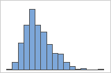
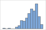
Right-skewed
Left-skewed
The histogram with right-skewed data shows wait times. Most of the wait times are relatively short, and only a few wait times are long. The histogram with left-skewed data shows failure time data. A few items fail immediately, and many more items fail later.
Identify outliers
Outliers, which are data values that are far away from other data values, can strongly affect the results of your analysis. Often, outliers are easiest to identify on a boxplot.
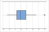
On a boxplot, asterisks (*) denote outliers.
Try to identify the cause of any outliers. Correct any data–entry errors or measurement errors. Consider removing data values for abnormal, one-time events (also called special causes). Then, repeat the analysis. For more information, go to Identifying outliers.
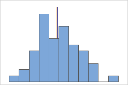
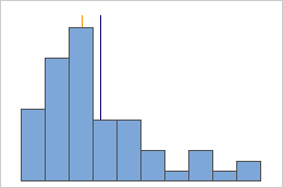
Look for multi-modal data
Multi-modal data have multiple peaks, also called modes. Multi-modal data often indicate that important variables are not yet accounted for.
If you have additional information that allows you to classify the observations into groups, you can create a group variable with this information. Then, you can create the graph with groups to determine whether the group variable accounts for the peaks in the data.
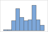
Simple
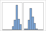
With Groups
For example, a manager at a bank collects wait time data and creates a simple histogram. The histogram appears to have two peaks. After further investigation, the manager determines that the wait times for customers who are cashing checks is shorter than the wait time for customers who are applying for home equity loans. The manager adds a group variable for customer task, and then creates a histogram with groups.