Find definitions and interpretation guidance for every graph that is provided with the attribute agreement analysis.
In This Topic
Within Appraisers graph
If you have multiple trials, Minitab displays the Within Appraisers graph
The Within Appraisers graph shows the consistency of each appraiser's ratings. The graph contains the following components for each appraiser:
- Blue circle: The actual percentage matched.
- Red line: The 95.0% confidence interval for percentage matched.
- Blue Xs: The lower and upper limits for the 95.0% confidence interval.
Interpretation
This interval plot indicates that Amanda has the most consistent ratings and Eric has the least consistent ratings. 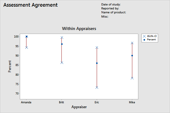
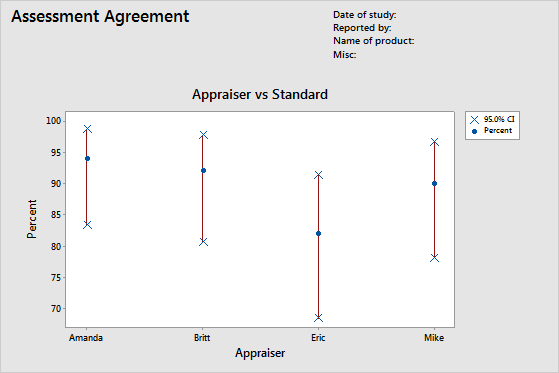
Appraiser vs Standard graph
If you specify a reference value for each part, Minitab displays the Appraiser vs Standard graph.
The Appraiser vs Standard graph shows the correctness of each appraiser's ratings. The graph contains the following components for each appraiser:
- Blue circle: The actual percentage matched.
- Red line: The 95.0% confidence interval for percentage matched.
- Blue Xs: The lower and upper limits for the 95.0% confidence interval.
Interpretation
This interval plot indicates that Amanda has the most correct ratings and Eric has the least correct ratings.