In This Topic
Step 1: Determine whether the process variation is in control
The CUSUM chart plots the cumulative sums (CUSUMs) of the deviations of each sample value from the target value. Because the CUSUM chart is cumulative, even minor drifting in the process mean will cause steadily increasing (or decreasing) cumulative deviation values.
You can create either a tabular CUSUM or a V-mask CUSUM.
Tabular CUSUM
- Plotted points (dots), which are the cumulative sum of deviations above the target.
- Plotted points (diamonds), which are the cumulative sum of deviations below the target.
- Center line, which is located at zero.
- Control limits, which are located 4 standard deviations from the center line.
- Upward or downward trends in the upper and lower CUSUMs. The plotted points should fluctuate randomly around zero. If an upward or downward trend develops, the process mean has shifted and the process may be affected by special causes.
- Plotted points that are located beyond the control limits, which indicates that the process is out of control.
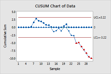
In these results, the lower CUSUM indicates an out-of-control condition from subgroup 24 and on. These out-of-control points, which are indicated by the red triangles, fall below the lower control limit. When you hold the pointer over a red point, you can get more information about this point.
V-mask CUSUM
- Plotted points, which are the cumulative sum of deviations of the sample values from the target.
- V-mask, which is used instead of control limits to determine out-of-control points. The V-mask standardizes the deviations from the target value, and plots the deviations from this value.
- Upward or downward trends in the CUSUMs. If an upward or downward trend develops, the process mean has shifted and the process may be affected by special causes.
- Plotted points that are located beyond the V-mask, which indicates that the process is out of control.
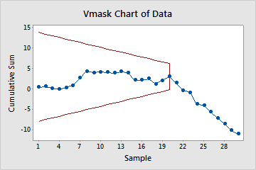
In these results, the V-mask is centered on subgroup 20 because the shift in the process mean occurred after subgroup 20. The CUSUM then begins a downward trend, indicating that the process mean has shifted.
Step 2: Identify which points failed the test
When you create a CUSUM chart, a table displays which points are beyond the control limits. Investigate any subgroups that are outside of the control limits.