In This Topic
Step 1: Assess the key characteristics
Examine the center and spread of the distribution. Assess how the sample size may affect the appearance of the boxplot.
Center and spread
- Median
- The median is represented by the line in the box. The median is a common measure of the center of your data. Half the observations are less than or equal to it, and half are greater than or equal to it.
- Interquartile range box
- The interquartile range box represents the middle 50% of the data. It shows the distance between the first and third quartiles (Q3-Q1).
- Whiskers
- The whiskers extend from either side of the box. The whiskers represent the ranges for the bottom 25% and the top 25% of the data values, excluding outliers.
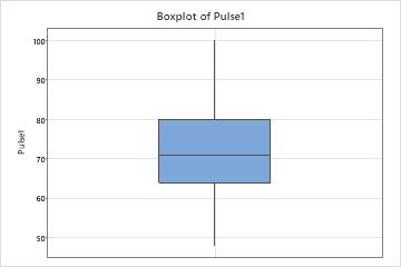
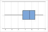
Hold the pointer over the boxplot to display a tooltip that shows these statistics. For example, this boxplot of resting heart rates shows that the median heart rate is 71. Most subjects have a resting heart rate that is between 64 and 80, but some subjects have heart rates that are as low as 48 and as high as 100.
Investigate any surprising or undesirable characteristics on the boxplot. For example, a boxplot may show that the median length of wood boards is much lower than the target length of 8 feet.
Note
Because the quartiles of the boxplot are calculated values, they may not be actual observations in your data set. For more information on how to interpret the quartiles, go to What are quartiles?. For specific information on how the quartiles are calculated, go to Methods and formulas for Graphical Summary.
Sample size (n)
The sample size can affect the appearance of the graph.
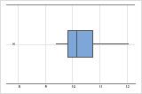
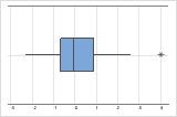
n = 15
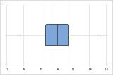
n = 500
A boxplot works best when the sample size is at least 20. If the sample size is too small, the quartiles and outliers shown by the boxplot may not be meaningful. If the sample size is less than 20, consider using an Individual value plot instead.
Step 2: Look for indicators of nonnormal or unusual data
Skewed data indicate that data may be nonnormal. Outliers may indicate other conditions in your data.
Skewed data
When data are skewed, the majority of the data are located on the high or low side of the graph. Skewness indicates that the data may not be normally distributed.
These boxplots illustrate skewed data. The boxplot with right-skewed data shows wait times. Most of the wait times are relatively short, and only a few wait times are long. The boxplot with left-skewed data shows failure time data. A few items fail immediately and many more items fail later.
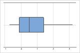
Right-skewed
Left-skewed
If you know that your data are not naturally skewed, investigate possible causes. If you want to analyze severely skewed data, read the data considerations topic for the analysis to make sure that you can use data that are not normal.
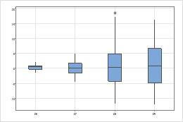
Outliers
Outliers, which are data values that are far away from other data values, can strongly affect your results. Often, outliers are easiest to identify on a boxplot.
Tip
Hold the pointer over the outlier to identify the data point.
Try to identify the cause of any outliers. Correct any data entry or measurement errors. Consider removing data values that are associated with abnormal, one-time events (special causes). Then, repeat the analysis.
Step 3: Assess and compare groups
If your boxplot has groups, assess and compare the center and spread of groups.
Centers
Look for differences between the centers of the groups.
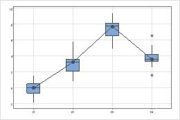
Spreads
Look for differences between the spreads of the groups.
- Use a 2 variances test if you have only two groups.
- Use a test for equal variances if you have three or more groups.