In This Topic
Step 1: Look for a model relationship and assess its strength
Determine which model relationship best fits your data and assess the strength of the relationship.
Tip
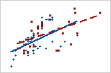
To better visualize how well a particular model fit suits your data, create a scatterplot with a fitted regression line.
Type of relationship
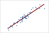
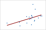
Linear: positive
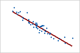
Linear: negative
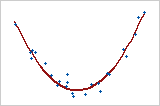
Curved: quadratic
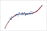
Curved: cubic
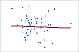
No relationship
If your data seem to fit a model, you can explore the relationship using a regression analysis.
Strength of relationship
Weaker relationship
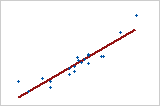
Stronger relationship
To quantify the strength of a linear (straight) relationship, use a correlation analysis.
Step 2: Look for indicators of nonnormal or unusual data
Skewed data and multi-modal data indicate that data may be nonnormal. Outliers may indicate other conditions in your data.
Skewed data
When data are skewed, the majority of the data are located on the high or low side of the graph. Skewness indicates that the data may not be normally distributed. In a marginal plot, look at the graphs in the margins for indicators of skewed data.
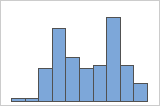
- Histograms
-
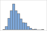
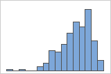
Right-skewed
Left-skewed
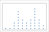
- Dotplots
-
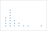
Right-skewed
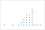
Left-skewed
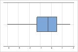
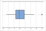
- Boxplots
-
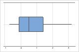
Right-skewed
Left-skewed
If you know that your data are not naturally skewed, investigate possible causes. If you want to analyze severely skewed data, read the data considerations topic for the analysis to make sure that you can use data that are not normal.
Outliers
Outliers, which are data values that are far away from other data values, can strongly affect your results. In a marginal plot, look at the scatterplot and the graphs in the margins for outliers.
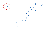
- Scatterplot
-
On a scatterplot, isolated points identify outliers.
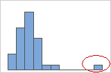
- Histogram
-
On a histogram, isolated bars at the ends identify outliers.
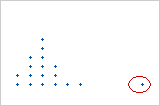
- Dotplot
-
On a dotplot, unusually low or high data values identify possible outliers.
- Boxplot
-
On a boxplot, outliers are identified by asterisks (*).
Try to identify the cause of any outliers. Correct any data entry or measurement errors. Consider removing data values that are associated with abnormal, one-time events (special causes). Then, repeat the analysis.
Multi-modal data
Multi-modal data have more than one peak. (A peak represents the mode of a set of data.) Multi-modal data usually occur when the data are collected from more than one process or condition, such as at more than one temperature.
Histogram
Dotplot
If you have additional information that allows you to classify the observations into groups, you can create a group variable with this information. Then, you can create a histogram or dotplot with groups to determine whether the group variable accounts for the peaks in the data.
Step 3: Look for group-related patterns
You can look for patterns in the graph that may indicate your data contain groups. Look for differences in x-y relationships between groups of observations. Finding meaningful groups can help you describe your data more precisely.
The following graphs are examples of group related patterns.
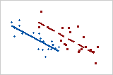
- Groups with different slopes
- When a group has a steeper slope, changes in x-values are associated with greater changes in y-values.
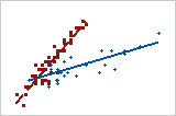
- Groups with different locations
- One group has consistently higher y-values for each specific value of x than the other group.
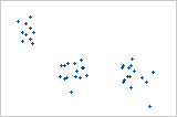
- Groups in clusters
- The three clusters in this scatterplot indicate three groups.
- No group-related pattern
- These two groups don't seem to be different.
If you suspect that your data contain groups, you can create a scatterplot with groups to visualize the groups.