Technicians measure heat flux as part of a solar thermal energy test. An energy engineer wants to determine how heat flux is predicted by the position of the east, south, and north focal points.
The engineer fits the regression model and uses a surface plot to illustrate the relationship between the fitted values of heat flux and the settings for the east and the south focal points.
- Open the sample data, ThermalEnergyTest.MTW.
- Choose .
- From Response, select Heat Flux.
- Under Select a pair of variables for a single plot, select East from X Axis and select South from Y Axis.
- Click OK.
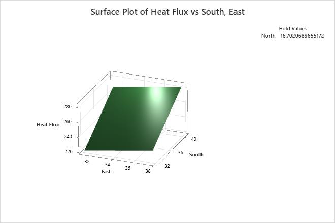
Interpret the results
Minitab uses the stored model to create the surface plot. The highest values of Heat Flux are in the upper right corner of the plot, which corresponds with high values of both East and South. The lowest values of Heat Flux are in the lower left corner of the plot, which corresponds with low values of both East and South. The third predictor, North, is not displayed in the plot. Minitab holds the value of North constant at approximately 16.7 when calculating the fitted response values of Heat Flux. If you change this hold value, the response surface also changes, sometimes drastically.
Tip
To annotate the values of the predictors and the responses for any point on this plot, use Plant Flag. To plant a flag, right-click the plot, choose Plant Flag in the menu that appears, and then click the point on the plot that you want to annotate. Use Predict to determine whether these points are unusual and to assess the precision of the predictions.