Technicians measure heat flux and insolation as part of a solar thermal energy test. An energy engineer wants to determine how heat flux and insolation are predicted by the position of the east, south, and north focal points.
The engineer wants to arrange the focal points to receive a sufficient amount of solar radiation without generating excessive heat. The engineer fits regression models for both responses and uses an overlaid contour plot to find predictor settings that produce acceptable values for both responses: HeatFlux and Insolation.
- Open the sample data, ThermalEnergyTest.MTW.
- Choose .
- Under Responses, move Insolation and Heat Flux from the Available list to the Selected list.
- Under Variables, select North from X Axis and select South from Y Axis.
- Click Contours.
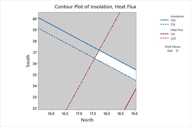
- Complete the Low and High columns of the table as shown below, then click OK.
Response Low High Insolation 725 775 Heat Flux 175 225 - Click Settings.
- Under Hold continuous variables at, enter 31.
- Click OK in each dialog box.
Interpret the results
Minitab uses the stored models to create the overlaid contour plot. The white area in the plot displays the combination of values for North and South that yield satisfactory fitted values for both response variables. The third predictor, East, is not displayed in the plot. Minitab holds the value of East constant at 31 in order to calculate the fitted response values of both Insolation and Heat Flux. You can increase or decrease the holding value to see the plot change.
The white area in the plot displays the combination of values for North and South that yield satisfactory fitted values for Isolation and Heat Flux when East is held at 31. To understand the feasible region that is formed by the three factors, you should repeat the process to obtain plots for all pairs of factors.
You can use the plots in combination with the Response Optimizer to find the best operating conditions for the focal points.
Tip
To annotate the values of the predictors and the responses for any point on this plot, use Plant Flag. To plant a flag, right-click the plot, choose Plant Flag in the menu that appears, and then click the point on the plot that you want to annotate. Use Predict to determine whether these points are unusual and to assess the precision of the predictions.