A financial analyst investigates the factors that are associated with the probability that a college student has certain credit cards. The analyst randomly samples college students for a survey. The survey asks the students questions about their education and finances.
For marketing purposes, the analyst wants to identify predictor values that are associated with the population of students who have a low probability of having a MasterCard and a high probability of having an American Express credit card. The analyst fits binary logistic regression models for both American Express and MasterCard to determine how the predictors are associated with the probability of having each of these credit cards.
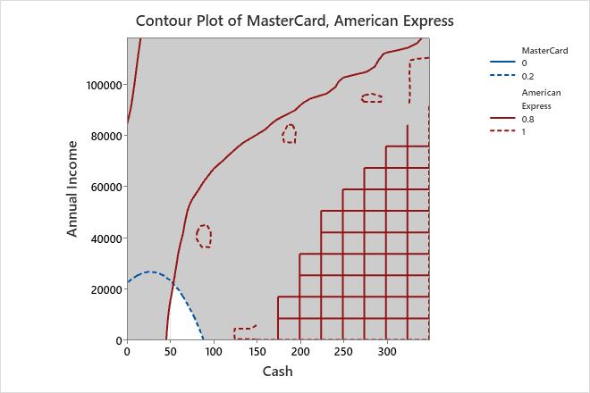
After fitting the models, the analyst uses an overlaid contour plot to find predictor settings that produce acceptable probabilities for both credit cards.
- Open the sample data, CreditSurvey.MTW.
- Choose .
- Under Responses, move MasterCard and American Express from the Available list to the Selected list.
- Under Variables, select Cash from X Axis and select Annual Income from Y Axis.
- Click Contours.
- Complete the Low and High columns of the table as shown below, then click OK.
Response Low High MasterCard 0 0.2 American Express 0.8 1 - Click OK in each dialog box.
Interpret the results
Minitab uses the stored models to create the overlaid contour plot. The white area in the plot displays the combination of values for annual income and cash that yield satisfactory fitted values for the probability of possessing each credit card.
You can use the plots in combination with the Response Optimizer to find the best values of the predictors.
Tip
To annotate the values of the predictors and the responses for any point on this plot, use Plant Flag. To plant a flag, right-click the plot, choose Plant Flag in the menu that appears, and then click the point on the plot that you want to annotate. Use Predict to determine whether these points are unusual and to assess the precision of the predictions.