The engineer wants to study how several predictors affect discoloration defects in resin parts. Because the response variable describes the number of times that an event occurs in a finite observation space, the engineer fits a Poisson model.
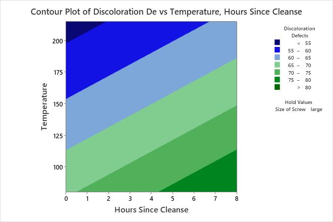
The engineer fits the Poisson model and uses a contour plot to illustrate the relationship between the fitted values of discoloration defects and the settings for the hours since the last cleanse and the transfer temperature.
- Open the sample data, ResinDefects.MTW.
- Choose .
- From Response, select Discoloration Defects.
- Under Select a pair of variables for a single plot, select Hours Since Cleanse from X Axis and select Temperature from Y Axis.
- Click OK.
Interpret the results
Minitab uses the stored model to create the contour plot. The lowest number defects are in the upper left corner of the plot, which corresponds with higher temperatures and shorter times since the last cleanse. The third predictor, Size of Screw, is a categorical predictor and is not displayed in the plot. Minitab holds the value of screw size at "large" when calculating the fitted response values of the number of defects.
After assessing this plot, the analyst can change screw size from "large" to "small" and compare the number of defects on the new plot.
Tip
To annotate the values of the predictors and the responses for any point on this plot, use Plant Flag. To plant a flag, right-click the plot, choose Plant Flag in the menu that appears, and then click the point on the plot that you want to annotate. Use Predict to determine whether these points are unusual and to assess the precision of the predictions.