In This Topic
Step 1: Look for patterns in the data
A run chart plots your process data in the order that they were collected. Use a run chart to look for patterns or trends in your data that indicate the presence of special-cause variation.
Patterns in your data indicate that the variation is due to special causes that should be investigated and corrected. However, common-cause variation is variation that is inherent or a natural part of the process. A process is stable when only common causes, not special causes, affect the process output. If only common causes of variation exist in your process, the data exhibit random behavior.
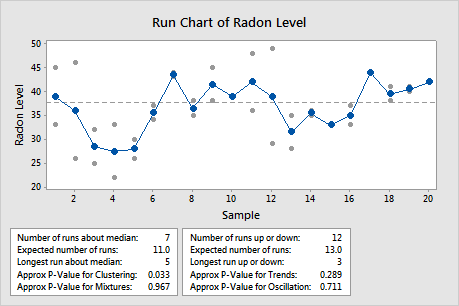
In these results, the data appear to show some clustering in samples 3 through 5.
Step 2: Determine whether mixtures and clusters are present
The test for number of runs about the median is based on the total number of runs that occur both above and below the median. A run about the median is one or more consecutive points on the same side of the center line. A run ends when the line that connects the points crosses the center line. A new run begins with the next plotted point.
This test detects two types of nonrandom behavior: mixtures and clusters.
An observed number of runs that is greater than the expected number of runs indicates mixtures. An observed number of runs that is less than the expected number of runs indicates clusters.
- Cluster patterns
- Clusters may indicate special-cause variation, such as measurement problems, lot-to-lot or set-up variability, or sampling from a group of defective parts. Clusters are groups of points in one area of the chart. If the p-value for clustering is less than 0.05, you may have clusters in your data.
-
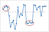
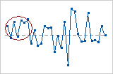
This chart shows possible clusters of data.
- Mixture patterns
- A mixture is characterized by frequent crossing of the center line. Mixtures often indicate combined data from two populations, or two processes operating at different levels. If the p-value for mixtures is less than 0.05, you may have mixtures in your data.
-
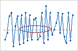
In this chart, the mixture may indicate that the data come from different processes.
Key Results: P-value for Clustering, P-Value for Mixtures
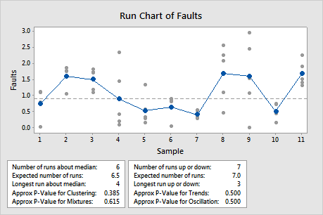
In this example, the p-value for clustering of 0.385 and the p-value for mixtures of 0.615 are greater than the α of 0.05. Therefore, you can conclude that the data does not indicate mixtures or clusters.
Step 3: Determine whether trends and oscillation are present
The test for number or runs up and down is based on the total number of observed runs up or down. A run up is an upward run of consecutive points that exclusively increases. A run down is a downward run of consecutive points that exclusively decreases. A run ends when the direction (either up or down) changes. For example, when the preceding value is smaller, a run up begins and continues until the proceeding value is larger than the next point, then a run down begins.
This test detects two types of nonrandom behavior: oscillation and trends.
An observed number of runs that is greater than the expected number of runs indicates oscillation. An observed number of runs that is less than the expected number of runs indicates trends.
- Trend patterns
- A trend is a sustained drift in the data, either up or down. Trends may warn that a process will soon go out of control. A trend can be caused by factors such as worn tools, a machine that does not hold a setting, or periodic rotation of operators. If the p-value for trends is less than 0.05, you may have a trend in your data.
-
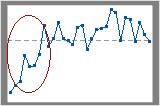
In this chart, the upward trend in the first few data points is easy to see.
- Oscillating patterns
- Oscillation occurs when the data fluctuates up and down, which indicates that the process is not steady. If the p-value for oscillation is less than 0.05, you may have oscillation in your data.
-
In this chart, the data seem to vary up and down frequently.
Key Results: P-Value for Trends, P-Value for Oscillation
In this example, the p-value for trends of 0.500 and the p-value for oscillation of 0.500 are greater than the α of 0.05. Therefore, you can conclude that the data does not indicate trends or oscillation.