The High Level Analytics Panel is a selection of key results about your process. They should quickly guide you to areas where there might be opportunities to improve your process. Then you can use Simul8's more extended results tools to do more deeper analysis.
The High Level Analytics Panel can be accessed from the Additional drop down menu on the Home tab. To change the High Level Analytics Panel view settings, right click anywhere in the panel window.
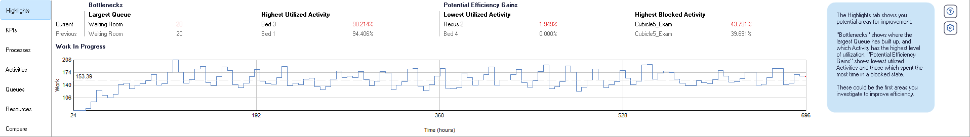
Highlights
The highlights panel at a glance shows you potential areas for improvement in your
process. It shows you were the most and least utilized areas of your process are so
that you can optimize your process to make it more efficient.
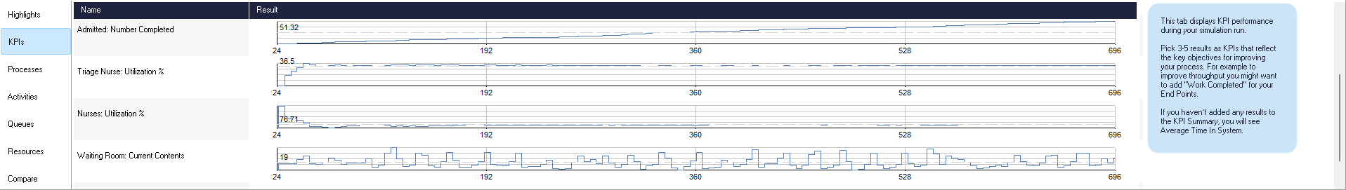
KPIs
The KPI tab shows how your KPIs are performing over the run. If you haven't
added any KPIs to the KPI Summary Simul8
will add Average Time in System for you.
The KPIs you pick should be ones that will tell you whether your key objective for
improving your process is being met. So for example if you want to increase
throughput, a good KPI would be number of Work Items processed. Ideally you should
aim to have about 3-5 KPIs.
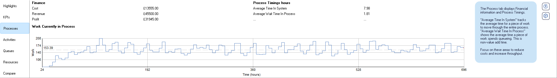
Process
The process tab gives you some general information about your process as a whole.
Average time in system lets you see the average time it's taking a piece of work
to exit your process from the time it entered, minimizing this will make your
process more lean and efficient. Average wait time, lets you see the average time
work is spending in Queues while moving through your process. This is non-value add
time, reducing this can really improve the efficiency of your process and reduce
costs.
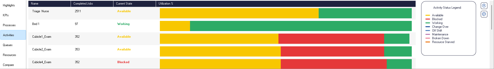
Activities
The Activities tab lets you see how all the Activities in your process are
performing. The Utilization chart will give you the most insight into what could be
improved. Hover over each chart to see a legend and a breakdown of time in each
state.
You want your Activities spending as much time Working as possible. You also want to
minimize time they spend waiting on work as this is time they could be working, so
why is that Activity being starved? Look at Blocked time too, this tells you the
Activity finished processing the work but something else further down in the process
prevented the work from being able to move on so the Activity was just sitting there
idle, that's lost working time.
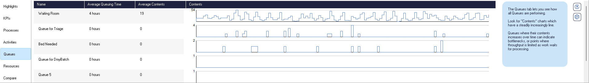
Queues
The Queues tab lets you see how all your Queues in your process are performing. Look
for Queues whose contents charts have a steadily increasingly line. These ones are
likely to indicate bottlenecks in your process because it shows there's more
and more work waiting to be processed, so something is limiting the throughput at
that point in the process.
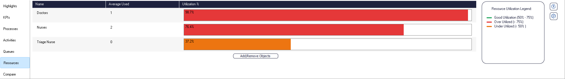
Resources
The Resources tab lets you quickly see how much your Resources are being used in your process.
If the Resource utilization is above 75% then the chart will show red as a warning.
In most processes you want to aim for a utilization of about 75%. This leaves enough
spare capacity for breaks etc.
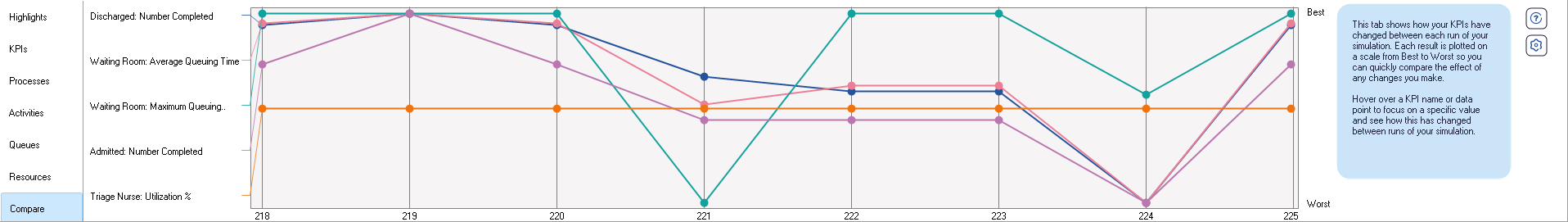
Compare
The compare tab lets you see how your KPIs have performed across the previous scenarios you have
run.
Each result is plotted on a Best vs Worse scale. This lets you see at a glance how
your scenario has performed across your KPIs
as a whole. So visually you can see whether a scenario is better or worse than the
other.
Hover over the KPI name or the plotted points on the chart to see the values of the
data points.