In This Topic
Step 1: Investigate alternative trees
The Misclassification Cost vs Number of Terminal Nodes Plot displays the misclassification cost for each tree in the sequence that produces the optimal tree. By default, the initial optimal tree is the smallest tree with a misclassification cost within one standard error of the tree that minimizes the misclassification cost. When the analysis uses cross-validation or a test data set, the misclassification cost is from the validation sample. The misclassification costs for the validation sample typically level off and eventually increase as the tree grows larger.
- The optimal tree is part of a pattern when the misclassification costs decrease. One or more trees that have a few more nodes are part of the same pattern. Typically, you want to make predictions from a tree with as much prediction accuracy as possible. If the tree is simple enough, you can also use it to understand how each predictor variable affects the response values.
- The optimal tree is part of a pattern when the misclassification costs are relatively flat. One or more trees with similar model summary statistics have much fewer nodes than the optimal tree. Typically, a tree with fewer terminal nodes gives a clearer picture of how each predictor variable affects the response values. A smaller tree also makes it easier to identify a few target groups for further studies. If the difference in prediction accuracy for a smaller tree is negligible, you can also use the smaller tree to evaluate the relationships between the response and the predictor variables.
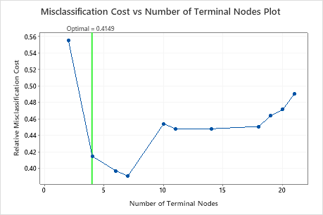
4 Node CART® Classification: Heart Disease versus Age, Rest Blood Pressure, Cholesterol, Max Heart Rate, Old Peak, Sex, Fasting Blood Sugar, Exercise Angina, Rest ECG, Slope, Thal, Chest Pain Type, Major Vessels
Key Results: Plot and Model Summary for Tree with 4 Nodes
The tree in the sequence with 4 nodes has a misclassification cost close to 0.41. The pattern when the misclassification cost decreases continues after the 4-node tree. In a case like this, the analysts choose to explore some of the other simple trees that have lower misclassification costs.
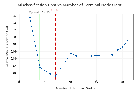
7 Node CART® Classification: Heart Disease versus Age, Rest Blood Pressure, Cholesterol, Max Heart Rate, Old Peak, Sex, Fasting Blood Sugar, Exercise Angina, Rest ECG, Slope, Thal, Chest Pain Type, Major Vessels
Key Results: Plot and Model Summary for Tree with 7 Nodes
The classification tree that minimizes the relative cross-validated misclassification cost has 7 terminal nodes and a relative misclassification cost of about 0.39. Other statistics, such as the area under the ROC curve also confirm that the 7-node tree performs better than the 4-node tree. Because the 7-node tree has few enough nodes that it is also easy to interpret, the analysts decide to use the 7-node tree to study the important variables and to make predictions.
Step 2: Investigate the purest terminal nodes on the tree diagram
After you select a tree, investigate the purest terminal nodes on the diagram. Blue represents the event level, and Red represents the nonevent level.
Note
You can right-click the tree diagram to show the Node Split View of the tree. This view is helpful when you have a large tree and want to see only the variables that split the nodes.
Nodes continue to split until the terminal nodes cannot be split into further groupings. The nodes that are mostly blue indicate a strong proportion of the event level. The nodes that are mostly red indicate a strong proportion of the nonevent level.
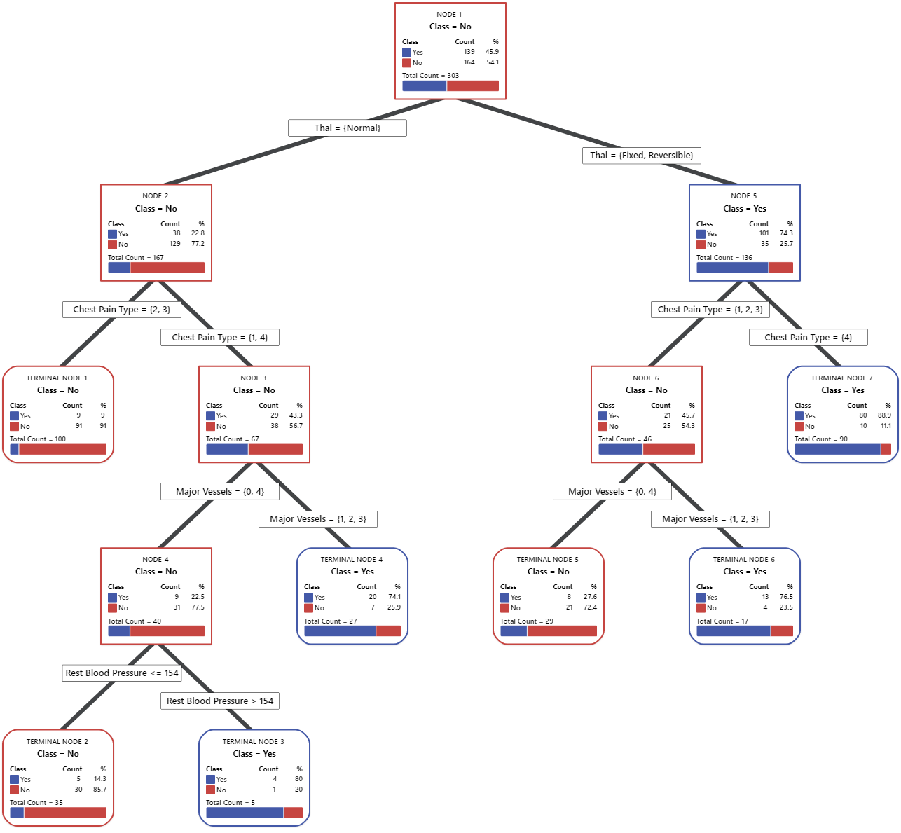
Key Result: Tree Diagram
This classification tree has 7 terminal nodes. Blue is for the event level (Yes) and Red is for the nonevent level (No). The tree diagram uses the training data set. You can toggle views of the tree between the detailed and node split view.
- Node 2: THAL was Normal for 167 cases. Of the 167 cases, 38 or 22.8% are Yes, and 129 or 77.2% are No.
- Node 5: THAL was Fixed or Reversible for 136 cases. Of the 136 cases, 101 or 74.3% are Yes, and 35 or 25.7% are No.
The next splitter for both the left child node and the right child node is Chest Pain Type, where pain is rated as 1, 2, 3, or 4. Node 2 is the parent to Terminal Node 1, and Node 5 is the parent to Terminal Node 7.
- Terminal Node 1: For 100 cases, THAL was Normal, and Chest Pain was 2 or 3. Of the 100 cases, 9 or 9% are Yes, and 91 or 91% are No.
- Terminal Node 7: For 90 cases, THAL was Fixed or Reversible, and Chest Pain was 4. Of the 90 cases, 80 or 88.9% are Yes, and 10 or 11.1% are No.
Step 3: Determine the important variables
Use the relative variable importance chart to determine which predictors are the most important variables to the tree.
Important variables are a primary or surrogate splitters in the tree. The variable with the highest improvement score is set as the most important variable, and the other variables are ranked accordingly. Relative variable importance standardizes the importance values for ease of interpretation. Relative importance is defined as the percent improvement with respect to the most important predictor.
Relative variable importance values range from 0% to 100%. The most important variable always has a relative importance of 100%. If a variable is not in the tree, that variable is not important.
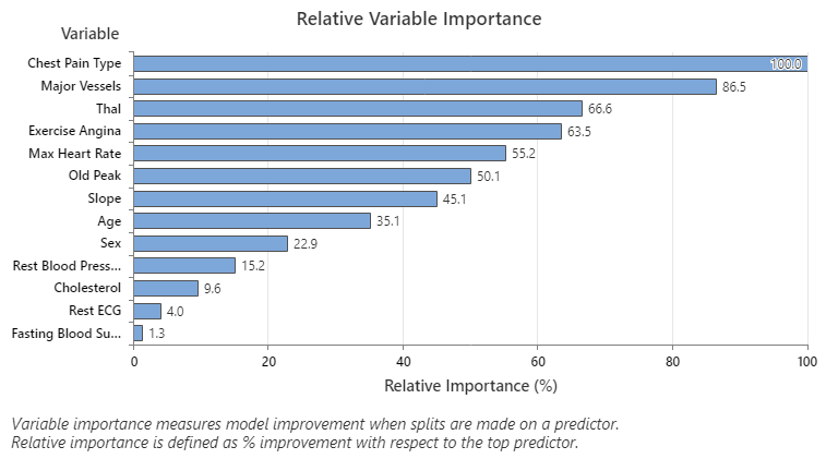
Key Result: Relative Variable Importance
- Major Vessels is about 87% as important as Chest Pain Type.
- Thal and Exercise Angina are both about 65% as important as Chest Pain Type.
- Max Heart Rate is about 55% as important as Chest Pain Type.
- Old Peak is about 50% as important as Chest Pain Type.
- Slope, Age, Sex, and Rest Blood Pressure are much less important than Chest Pain Type.
Although they have positive importance, analysts might decide that Cholesterol, Rest ECG, and Fasting Blood Sugar are not important contributors to the tree.
Step 4: Evaluate the predictive power of your tree
The most accurate tree is the one with the lowest misclassification cost. Sometimes, simpler trees with slightly higher misclassification costs work just as well. You can use the Misclassification Cost vs. Terminal Nodes Plot to identify alternate trees.
The Receiver Operating Characteristic (ROC) Curve shows how well a tree classifies the data. The ROC curve plots the true positive rate on the y-axis and the false positive rate on the x-axis. The true positive rate is also known as power. The false positive rate is also known as Type I error.
When a classification tree can perfectly separate categories in the response variable, then the area under the ROC curve is 1, which is the best possible classification model. Alternatively, if a classification tree cannot distinguish categories and makes assignments completely randomly, then the area under the ROC curve is 0.5.
When you use a validation technique to build the tree, Minitab provides information about the performance of the tree on the training and validation (test) data. When the curves are close together, you can be more confident that the tree is not overfit. The performance of the tree with the test data indicates how well the tree can predict new data.
- True positive rate (TPR) — the probability that an event case is predicted correctly
- False positive rate (FPR) — the probability that a nonevent case is predicted incorrectly
- False negative rate (FNR) — the probability that an event case is predicted incorrectly
- True negative rate (TNR) — the probability that a nonevent case is predicted correctly
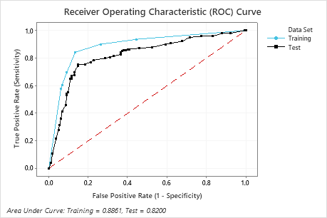
Key Result: Receiver Operating Characteristic (ROC) Curve
For this example, the area under the ROC curve is 0.886 for Training and 0.82 for Test. These values indicate that the classification tree is a reasonable classifier, in most applications.
7 Node Classification Tree: Heart Disease versus Age, Rest Blood Pressure, Cholesterol, Max Heart Rate, Old Peak, Sex, Fasting Blood Sugar, Exercise Angina, Rest ECG, Slope, Thal, Chest Pain Type, Major Vessels
Key Result: Confusion Matrix
- True positive rate (TPR) — 84.2% for the Training data and 75.5% for the Test data
- False positive rate (FPR) — 13.4% for the Training data and 14.6% for the Test data
- False negative rate (FNR) — 15.8% for the Training data and 24.5% for the Test data
- True negative rate (TNR) — 86.6% for the Training data and 85.4% for the Test data
Overall, the %Correct for the Training data is 85.5% and 80.9% for the Test data.