About project lines
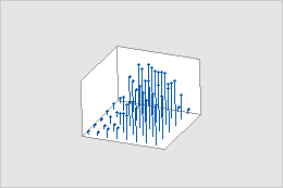
You can add project lines to scatterplots, matrix plots, histograms, time series plots, 3D scatterplots, and 3D surface plots.
Examples
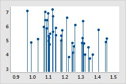
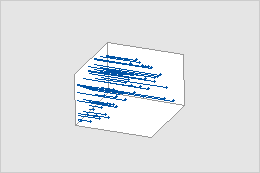
Show position relative to an axis
This example shows where the data points fall along the x-axis. If you want to discern where points fall on the y-axis, change the projection direction.
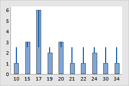
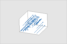
Show distance from a target
This example shows how far data points extend from a target of 2.5. If you want to evaluate a different target value, change the base position.
Create a graph with project lines
You can add project lines to scatterplots, matrix plots, histograms, time series plots, 3D scatterplots, and 3D surface plots.
- In the dialog box for the graph you are creating, click Data View.
- On the Data Display tab, select Project lines.
Add project lines to a graph
You can add project lines to scatterplots, matrix plots, histograms, time series plots, 3D scatterplots, and 3D surface plots.
- Double-click the graph.
- Right-click the graph and choose .
- Select Project lines.
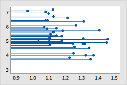
Change the projection direction of project lines
The projection direction is the direction in which the project lines extend on the graph. By default, the direction is toward the x-axis, or the xy-plane for 3D graphs. However, you can change the projection direction to discern where points fall on the y-axis.
- Double-click the graph.
- Double-click a project line.
-
On the
Options
tab, under
Projection Direction,
choose one of the following options:
Toward X Scale
Toward Y Scale
Toward XY plane
Toward YZ plane
Toward XZ plane
Change the base position of project lines
The base position is the value from which project lines originate. Graphed values greater than the base position project up from the line; graphed values less than the base position project down from the line.
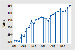
Base position = 0
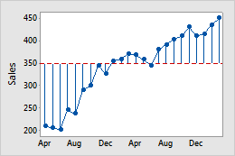
Base position = 350
Example of changing the base position
In the example, the base position of the time series plot was changed from 0 to 350, which corresponds to a sales goal. You can see how far away each point is in either direction from the sales goal.
- Double-click the graph.
- Double-click a project line.
- On the Options tab, under Base Position, click Custom and enter a value for the base position.
Change the appearance
Tip
To change the default settings and attributes for graph elements, choose .
- Double-click the graph.
- Double-click a project line.
- On the Attributes tab, select the attributes that you want.
Use jitter to reveal overlapping data
If you have identical data values on your graph, these data points may overlap and appear hidden behind each other. Jitter randomly nudges each point to help reduce overlap. Because jitter is random, the position of each point is slightly different each time you recreate the same graph.
- Double-click the graph.
- Double-click a project line.
- On the Attributes tab, to adjust the amount of jitter, enter different values.