About connect lines
Connect lines appear by default on time series plots, empirical CDF plots, and line plots. You can add a connect line to scatterplots, matrix plots, bar charts, boxplots, interval plots, and individual value plots.
Examples of connect lines
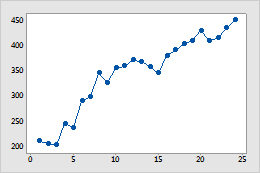
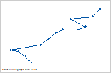
Scatterplot
This example shows monthly sales increasing over time.
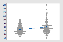
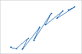
Individual value plot
This example shows that the average sales for one store is slightly higher than for the other.
Add a connect line when you create a graph
You can add a connect line to scatterplots, matrix plots, bar charts, and histograms.
- In the dialog box for the graph you are creating, click Data View.
- On the Data Display tab, select Connect line.
Add a connect line to an existing graph
You can add a connect line to scatterplots, matrix plots, bar charts, and histograms.
- Double-click the graph.
- Right-click the graph and choose .
- Select Connect line.
Change the function of a connect line
The connection function is the way in which Minitab connects the data values for connect lines. By default, Minitab uses a straight connection, but you can change the function for a different effect; for example, to show accumulating sums by steps.
- Double-click the graph.
- Double-click the connect line.
-
On the
Options
tab or the
Connect
Options
tab, under
Connection Function,
choose one of the following:
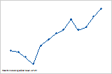
Straight
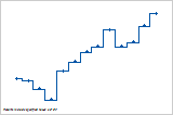
Step: Center
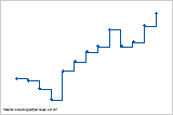
Step: Left
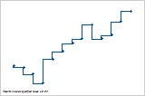
Step: Right
- Click OK.
Change the connection order of a connect line
The connection order is the order in which Minitab connects points. This option is not available for all graphs.
- Double-click the graph.
- Double-click the connect line.
-
On the
Options
tab, under
Connection Order,
choose one of the following:
Increasing X
Increasing Y
Worksheet
Note
When using the Worksheet connection order the graph's appearance depends on the arrangement of your worksheet.
- Click OK.
Change the appearance of a connect line
You can edit the type, color, and size of connect lines.
- Double-click the graph.
- Double-click the connect line.
-
On the
Attributes
tab, change the type, color, and size of connect lines.
Tip
To change the default settings and attributes for graph elements, choose .
Use jitter to reveal overlapping data
If you have identical data values on your graph, these data points can overlap and appear hidden behind each other. Jitter randomly nudges each point to help reduce overlap. Because jitter is random, the position of each point is slightly different each time you recreate the same graph. This option is not available for all graphs.
- Double-click the graph.
- Double-click the connect line.
- On the Jitter tab, select Add jitter to direction. To adjust the amount of jitter, enter different values.