In This Topic
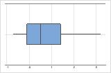
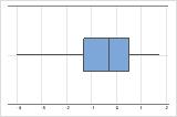
Boxplot
A boxplot provides a graphical summary of the distribution of each sample. The boxplot makes it easy to compare the shape, the central tendency, and the variability of the samples.
Interpretation
Use a boxplot to examine the spread of the data and to identify any potential outliers. Boxplots are best when the sample size is greater than 20.
- Skewed data
-
Examine the spread of your data to determine whether your data appear to be skewed. When data are skewed, the majority of the data are located on the high or low side of the graph. Skewed data indicates that the data might not be normally distributed. Often, skewness is easiest to detect with an individual value plot, a histogram, or a boxplot.
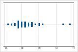
Right-skewed
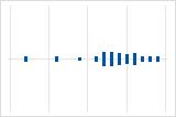
Left-skewed
The boxplot with right-skewed data shows average wait times. Most of the wait times are relatively short, and only a few of the wait times are longer. The boxplot with left-skewed data shows failure rate data. A few items fail immediately, and many more items fail later.
Data that are severely skewed can affect the validity of the p-value if your sample is small (< 20 values). If your data are severely skewed and you have a small sample, consider increasing your sample size.
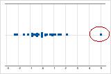
- Outliers
-
Outliers, which are data values that are far away from other data values, can strongly affect your results. Often, outliers are easiest to identify on a boxplot.
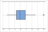
On a boxplot, asterisks (*) denote outliers.
Try to identify the cause of any outliers. Correct any data-entry errors or measurement errors. Consider removing data values for abnormal, one-time events (special causes). Then, repeat the analysis.
Individual value plot
An individual value plot displays the individual values in each sample. The individual value plot makes it easy to compare the samples. Each circle represents one observation. An individual value plot is especially useful when your sample size is small.
Interpretation
Use an individual value plot to examine the spread of the data and to identify any potential outliers. Individual value plots are best when the sample size is less than 50.
- Skewed data
-
Examine the spread of your data to determine whether your data appear to be skewed. When data are skewed, the majority of the data are located on the high or low side of the graph. Skewed data indicate that the data might not be normally distributed. Often, skewness is easiest to detect with an individual value plot, a histogram, or a boxplot.
Right-skewed
Left-skewed
The individual value plot with right-skewed data shows wait times. Most of the wait times are relatively short, and only a few wait times are longer. The individual value plot with left-skewed data shows failure time data. A few items fail immediately, and many more items fail later.
- Outliers
-
Outliers, which are data values that are far away from other data values, can strongly affect your results. Often, outliers are easy to identify on an individual value plot.
On an individual value plot, unusually low or high data values indicate potential outliers.
Try to identify the cause of any outliers. Correct any data-entry errors or measurement errors. Consider removing data values for abnormal, one-time events (special causes). Then, repeat the analysis.
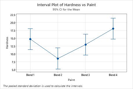
Interval plot
Use the interval plot to display the mean and confidence interval for each group.
- Each dot represents a sample mean.
- Each interval is a 95% individual confidence interval for the mean of a group. You can be 95% confident that the group mean is within the group's confidence interval.
Important
Interpret these intervals carefully because your rate of type I error increases when you make multiple comparisons. That is, the more comparisons you make, the higher the probability that at least one comparison will incorrectly conclude that one of the observed differences is significantly different.
Interpretation
In these results, Blend 2 has the lowest mean and Blend 4 has the highest. You cannot determine from this graph whether any differences are statistically significant. To determine statistical significance, assess the confidence intervals for the differences of means.