Use a contour plot to see how a response variable relates to two predictor variables. A contour plot provides a two-dimensional view in which all points that have the same response are connected to produce contour lines of constant responses. Contour plots are useful for investigating desirable response values and operating conditions.
- Predictors on the x- and y-axes.
- Contour lines that connect points that have the same response value.
- Colored contour bands that represent ranges of the response values.
Minitab uses interpolation to create the area between data points. For more information, go to Mesh.
Tip
To see the exact values of the predictor variables represented by a point on the plot, right-click the plot and select Crosshairs. Then use your pointer to move the crosshair over the plot. Minitab displays the values of the predictor variables for each point in the upper left corner of the plot. For more information, go to Crosshairs and flags.
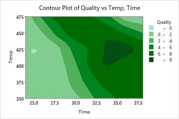
Key Results: Contour Plot
This contour plot shows the relationship between the time and temperature settings used to cook a frozen dinner and the quality score assigned by food testers. Darker regions indicate higher quality. These higher response values seem to form a ridge running from the upper middle to the lower right of the graph. The valleys in the lower left and the upper right of the graph represent time-temperature combinations that result in under-cooked or over-cooked entrees, respectively.