Open the summary editor
- Choose .
- In edit mode, choose one of the following options.
- To create a summary, select Add New Summary.
- To edit an existing summary, select the edit
button
 beside the summary to edit.
- In the summary editor, complete Steps #1 - 6 to create or edit the summary.
Step 1: Select the variables to summarize
- Counts

-
Read-only variables that count the number of items in the dashboard based on the selected report type. If you select a project report, Counts returns the number of projects included in the dashboard. If you select a task report, Counts returns the number of tasks included in the dashboard.
Use Counts with grouping variables to count projects with specific characteristics. For example, you might have a summary that shows Number of Projects by Location and/or Project Type, or you might have a summary that shows Number of Tasks by Priority and/or Status.
-
Single-Value Categories

-
Variables that have only one value per project. For example, a project can have only one value for Location, or a project can have only a single calculated value for Project Duration.
- Data Tables

-
Variables that include one or more rows of data per project. For example, the variable Actual Hard Savings in the Monthly Financials category has 12 rows of monthly hard savings data.
What if I change variables?
If you select a variable that is not compatible with any of the previously selected variables, Engage adds the selected variable and removes the variables that are not compatible.
- Counts
- Only compatible with variables within the Counts category. Number of Projects and Number of Tasks cannot be used in conjunction with any other variable within the Counts category.
- Single Value
- Compatible with single-value variables from any single-value category.
- Data Table
- Compatible only with multiple-entry variables within the selected data table.
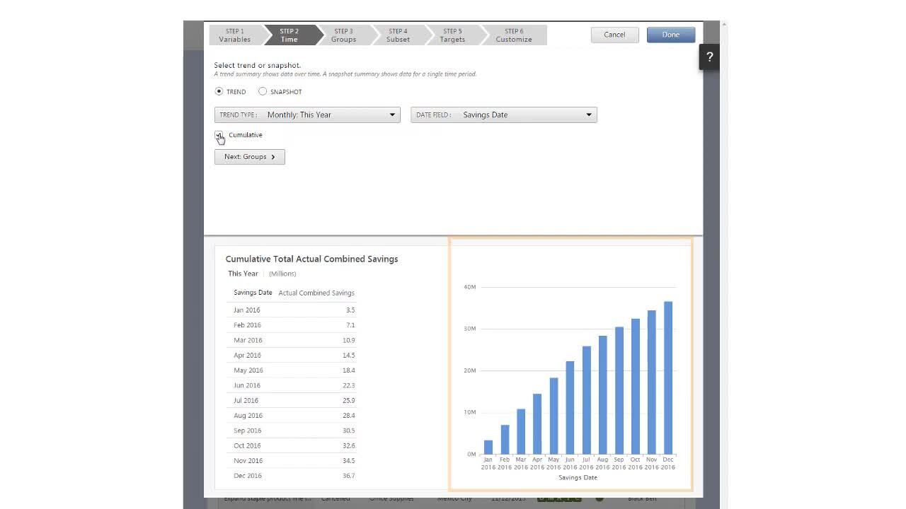
Step 2: Select a time period
Select the type of summary that shows the time period you want to see. A summary can be either Trend or Snapshot. For a list of examples, go to Trend and snapshot summaries.
- Trend
-
A trend summary shows data divided into multiple time periods. Select this summary to see the following type of project data.
- Total hard savings year-to-date, by month
- Average project duration last 3 years, by year
- Number of projects completed this year, by quarter
- Snapshot
-
A snapshot summary shows data for a single period of time. Select this summary to see the following type of project data.
- Total hard savings year-to-date
- Average project duration last year
- Number of projects completed this year
Step 3: Add one or more grouping variables
Grouping variables allow you to see project data by category.
For example, you might apply a grouping variable to see completed projects by location or number of projects by belt level.
- Trend
-
- If you select one summary variable, then you can select only one grouping variable.
- If you select two or more summary variables, then you cannot select a grouping variable.
- Snapshot
-
- If you select one summary variable, then you can select up to two grouping variables.
- If you select two or more summary variables, then you can select one grouping variable.
Tip
To hide groups that do not contain numeric data, select Exclude empty groups. When empty groups are populated, they are automatically shown again.
Step 4: Define a subset
Subsets allow you to focus on a set of projects that have specific characteristics. When you define a subset, you specify the projects to include in the summary calculations. Only the projects that match the criteria that you define are included in the summary.
- You want to calculate financial benefits for a group of plant locations.
- You want to summarize projects of a specific methodology, such as Just Do It or DMAIC.
- You want to create a report that does not require high-level filtering, so you create a summary of hard savings with three subsets: hard savings by green belt, hard savings by black belt, and hard savings by master black belt.
- You want to summarize a metric under a specific set of conditions, so you create a summary that shows the mean savings and duration of projects started by green belts this year.
- You reach the limit of grouping variables to use, so you create a summary for each grouping variable. For example, you create a summary for each business unit that shows the number of projects started and projects closed, year-to-date by belt type.
- Select one of the following
options.
- All: Performs an AND operation to return the projects that match all the criteria.
- Any: Performs an OR operation to return the projects that match any of the criteria.
- In the Subset Criteria table, you must add data
fields and conditions to define the subset. For a list of filter conditions,
go to Filter conditions.
- If you select a data field from a single-value category , select Select a condition, then set its condition. Engage uses this criteria to
evaluate projects and return results.
- If you select a data table , select Add table
criteria, then select the data fields and set conditions. Engage uses
this criteria to evaluate each row in the data table to return
results.
- If you select a data field from a single-value category
- Add as many data fields and conditions as necessary to define the subset.
Step 5: Add targets
Specify a value or a range of values to help you visualize progress toward your goal.
- From Target Type, select an option. Decide whether the goal for the selected variable is to achieve a high value or a low value. For example, higher is better when you summarize savings or number of projects, but lower is better when you summarize project costs, number of defects, or project duration. To add a single target value, choose a Green/Red option. To add a range of values, or a target threshold, choose a Green/Yellow/Red option.
- Next to Targets for the specified time period, select whether the target values should be different or the same for the time period you selected in Step 2. If the summary has a grouping variable, then choose whether the target values should be different or the same for each group. The options you choose control how you enter target values in the Targets table.
- From Scale for Entering Targets, select the scale to use when you enter target values. The table does not recalculate existing entries if you change the scale.
- In the Targets table, enter the target
values for the time periods and/or grouping variables in the summary.
Consider the following caveats.
- When you create a cumulative Trend summary, enter the non-cumulative target values for each time period. Engage accumulates the target values over time.
- When you create a time-based summary that includes a future time period, you can enter targets through the end of the current year, plus one additional year.
Rules for calculating overall and total targets
- Number of Projects/Events, Sum, Count, and Skipped Count
- The total target is the sum of the individual targets or thresholds.
- Mean and Median
- When the same target value is used for every row, the overall target equals the row target.
- When a summary includes multiple variables that use different functions, for example, the sum of hard savings and the mean cycle time.
- When a row or a column is missing a target value.
- When any other function is selected.
Step 6: Customize the summary
Customize how the summary appears in the dashboard report. To customize your summary, choose from different options on the three different tabs: Summary Settings, Table Settings, and Graph Settings. You can also edit some of the visual components that appear in the summary preview. To edit the summary title, select it and type the new text.
Summary Settings
- Include in Summary
- Choose whether to show a graph, a table, or both.
- Summary Arrangement
- If you include both a graph and a table, choose how to arrange them.
- Summary Width
- Set the width of the summary to 1, 2, or 3 columns.
- Scale
- The scaling factor that is used in table numbers and graph data labels. By default, numbers in a summary are scaled automatically; however, you can choose your own scale from the Scale menu.
- Show on Summary
- The selected time component for the summary. You can show or hide the subtitle, but you cannot edit it in the summary preview.
- Sort
- The selected variable that can be sorted. Tables, bar charts, and line charts are sorted in ascending or descending order, left-to-right or up-to-down. Pie charts are sorted in ascending or descending order clockwise, starting at 12:00.
Table Settings
- Rows & Columns
- The horizontal and vertical lines of data values in the table. When you transpose the rows and columns, the data values are switched.
- Show Totals
- You can show or hide row and/or column totals. Grand Total is only available when you select Row Totals.
- Show Headings
- You can show or hide table headings. To edit a table heading, select it and enter the new text.
Graph Settings
- Graph Type
- The visual representation of the aggregated project data for the
selected variables. You can choose different graph types and change
the color palette.
- Basic Bar Chart
- Use to compare categories of data. Each bar represents a category.
- Cluster Bar Chart
- Use to compare sub-categories of data. Each cluster of bars represents a category, divided into sub-categories. Sub-categories are the bars within a cluster.
- Stacked Bar Chart
- Use to compare the contribution of each sub-category to a category's total. Each bar represents the category total, divided into stacked sub-categories.
- Stacked % Bar Chart
- Use to compare the percent contribution of each sub-category across the categories. Each bar represents a category, scaled to 100% and divided into stacked sub-categories. This bar chart option shows the percent contribution from each sub-category.
- Line Chart
- Use to show data trends, usually over time.
- Pie Chart
- Use to show the proportion of each category relative to the total of all categories. Each slice represents a category.
- Color Palette
- The color key to the data plotted on the graph. To create your own color palette, choose Custom, then choose the colors to assign to the specific graph values. You can also change, add, or delete colors.
- Axis & Legend
- Swap which variable is represented on the x-axis of the graph. Only available with trend summaries when 2 or more variables are selected.
- Show on Graph
- You can show or hide data labels, which are the numeric values of the graph, but you cannot edit them.
- Show Headings
- You can show or hide graph headings, which are the names of the variables represented in the graph. To edit a graph heading, select it and enter the new text.
Watch a video
Watch a video to learn more about summaries.