Which graphs can I edit in the web app?
- Scatterplot
- Matrix Plot
- Bubble Plot
- Marginal Plot
- Histogram
- Dotplot
- Probability Plot
- Empirical CDF Plot
- Probability Distribution Plot
- Boxplot
- Interval Plot
- Individual Value Plot
- Line Plot
- Bar Chart
- Pie Chart
- Time Series Plot
- Area Graph
- Contour Plot
- 3D Scatterplot
- 3D Surface Plot
Note
You can only edit the above graphs if you created them using the Graph menu. You cannot edit any graphs that were generated through commands in the Stat menu.
How to edit a graph
To edit any of the above graphs in the web app:
- Create your graph.
-
In the output pane right-click the graph or click the graph and click
 , then choose
Graph Options.
, then choose
Graph Options.
- The options for graph editing in the web app vary for each graph. Make the modifications that you want in the right pane. The graph will automatically update when you make a change.
Text Annotations
Text annotation options include titles, subtitles, footnotes, and axis labels. The default title for a graph identifies the type of the graph and the variables that are presented in the graph. Some graphs also have default subtitles or footnotes.
Data Representations
You can modify the data displayed for Boxplot, Interval Plot, and Individual Value Plot.
- Interquartile range box (boxplot only)
- Display interquartile range boxes that represent the middle 50% of the data. The whiskers extend to the maximum and minimum data points within 1.5 box heights.
- Outlier symbols (boxplot only)
- Display outliers on a boxplot. An outlier is an unusually large or small observation.
- Median symbol
- Display a symbol that indicates the middle point of the data.
- Median confidence interval box
- Display the median confidence interval box that displays the 95% confidence intervals for the median.
- Range box (boxplot only)
- Display a box that extends from the minimum value to the maximum value.
- Median connect line
- Display a connect line that joins the medians when your graph has multiple groups.
- Mean bar
- Displays a bar to represent the mean of the categories.
- Mean symbol
- Display a symbol that indicates the average of the data.
- Mean confidence interval bar
- Display the mean confidence interval box that displays the 95% confidence intervals for the mean.
- Mean connect line
- Display a connect line that joins the means when your graph has multiple groups.
- Individual symbols
- Display each data point on the graph.
Scales
Scales for Scatterplots
- Logarithm
- A logarithmic scale linearizes logarithmic relationships by changing
the axis, so that the same distance represents different changes in value
across the scale. For example, in the scatterplot with the untransformed
x-scale, the function y = ln(x) is not linear. When you transform the x-scale
to logarithm base e, the form of the data is linear.
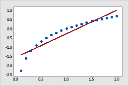
Untransformed x-scale
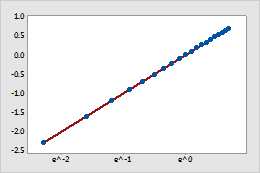
Transformed x-scale (log base e transformation)
Note
You cannot use a logarithmic scale if the data include non-positive values.
- Power
- For a power transformation, the data values are raised to the power
that you specify and the scale remains linear. For example, in the scatterplot
with the untransformed x-scale, the curvature in the data does not follow the
linear fitted regression line. When you perform a power transformation on the
x-scale, the data follow the linear fitted regression line.
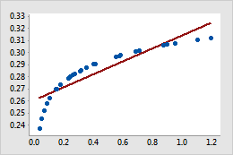
Untransformed x-scale
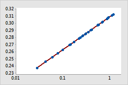
Transformed x-scale (power transformation)
Scales for Histogram
Bins are equally spaced intervals used to sort sample data for graphing. In Minitab, histograms plot the number of values that are in each bin.
Bins can be defined by either their midpoints (center values) or their cutpoints (boundaries). The appearance of the graph changes if you change the interval definition method.
- Midpoint
- Cutpoint
The number of bins affects the appearance of a graph. If there too few bins, the graph will be unrefined and will not represent the data well. If there are too many bins, many of the bins will be unoccupied and the graph may have too much detail.
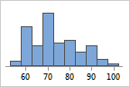
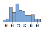
For example, the following histograms represent the same data with different numbers of bins. Minitab automatically calculates and uses an optimal number of bins. The middle graph (15 bins) is the Minitab default for these data.
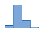
4 bins
15 bins
50 bins
Y-scale type for histogram
- Frequency
- The height of each bar represents the number of observations that fall within the bin.
- Percent
- The height of each bar represents the percentage of the sample observations that fall within the bin. A histogram with a percentage scale is sometimes called a relative frequency histogram. Use a percent scale to compare samples of different sizes.
- Density
- The area of each bar represents the proportion of the sample observations that fall within the bin (proportion = bar area = bin width × bar height).
- Accumulate values across bins
- (Frequency and percent scales only) The bar heights accumulate from left to right. The height of each bar is equal the height of the bin plus all the previous bins
Y-scale for probability plot
- Percent
- Values on the y-axis represent estimated cumulative percentages. The estimated cumulative percentage is equal to the estimated cumulative probability multiplied by 100.
- Probability
-
Values on the y-axis represent estimated cumulative probabilities. The cumulative probability for a value x is the probability that a random observation that is taken from the population will be less than or equal to x.
Minitab uses the median rank method (also called the Benard method) to estimate the cumulative probability (r) for each observation:
r = (i – 0.3) / (n + 0.4)
In this formula, i is the rank of the observation in the sample and n is the total number of observations in the sample. For the smallest value in the sample, i = 1 and for the largest value in the sample, i = n.
- Score
-
Values on the y-axis represent inverse cumulative probabilities.
The score values for the normal distribution and the lognormal distribution are the inverse cumulative probability of r, calculated using the standard normal distribution.
The score values for the exponential distribution and the Weibull distribution are calculated as LN(−LN(1−r)), where LN is the natural log function.
Y-scale for bar chart
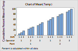
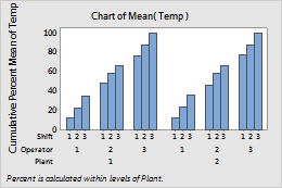
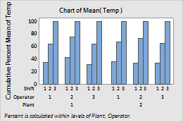
You can change the y-scale on a bar chart to a percentage scale, a cumulative scale, or both.
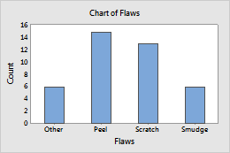
Default y-scale
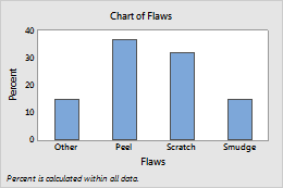
Show Y as Percent selected
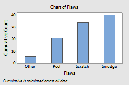
Accumulate Y across X selected
You can specify whether to calculate percents and accumulate values across the entire chart, or within the categories of the specified variable.
- Across all categories
- When you choose
Across all categories,
the bars accumulate to 100% across the entire chart.
- Within categories at level 1 (outermost)
- When you choose
Within categories at level 1 (outermost),
the bars accumulate to 100% within each level of Plant.
- Within categories at level 2
- When you choose
Within categories at level 2
the bars accumulate to 100% within each level of Operator.
Ordering
You can modify the order of bars in bars chart and slices in pie charts.
- Default
- For counts of unique values, Minitab represents the unique values in increasing order.
- Increasing Y
- Order bars or slices from smallest to largest.
- Decreasing Y
- Order bars or slices from largest to smallest.
Fits
A fitted regression line on a graph represents of the mathematical regression equation for your data. Use a fitted distribution line to assess how well sample data follow a specific theoretical distribution.
You can add or edit the distribution fit for scatterplots, histograms, and probability distribution plots in the Minitab web app. For more information on the available distributions, see Distributions for fitted lines.
Lines
Reference lines are horizontal or vertical lines that span the data region of a graph to designate goals or demarcations.
Gridlines provide a background grid at major and minor tick mark positions and provide points of reference on your graph.
Labels
Data labels give information about individual data representations on a graph. Different graphs have different types of data representations. Data labels are based on variables and data used in the graph.
Note
In the Minitab desktop app, you can specify columns of custom labels.
Orientation
For many graphs, you can specify either a vertical or horizontal display orientation.