In This Topic
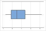
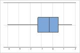
Boxplot
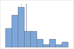
A boxplot provides a graphical summary of the distribution of a sample. The boxplot shows the shape, central tendency, and variability of the data.
Interpretation
Use a boxplot to examine the spread of the data and to identify any potential outliers. Boxplots are best when the sample size is greater than 20.
- Skewed data
-
Examine the spread of your data to determine whether your data appear to be skewed. When data are skewed, the majority of the data are located on the high or low side of the graph. Often, skewness is easiest to detect with a histogram or boxplot.
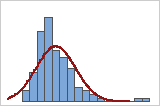
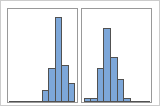
Right-skewed
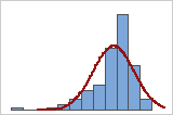
Left-skewed
The boxplot with right-skewed data shows wait times. Most of the wait times are relatively short, and only a few wait times are long. The boxplot with left-skewed data shows failure time data. A few items fail immediately, and many more items fail later.
- Outliers
-
Outliers, which are data values that are far away from other data values, can strongly affect the results of your analysis. Often, outliers are easiest to identify on a boxplot.
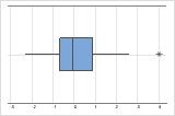
On a boxplot, asterisks (*) denote outliers.
Try to identify the cause of any outliers. Correct any data–entry errors or measurement errors. Consider removing data values for abnormal, one-time events (also called special causes). Then, repeat the analysis. For more information, go to Identifying outliers.
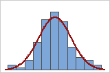
Histogram
A histogram divides sample values into many intervals and represents the frequency of data values in each interval with a bar.
Interpretation
Use a histogram to assess the shape and spread of the data. Histograms are best when the sample size is greater than 20.
- Skewed data
-
You can use a histogram of the data overlaid with a normal curve to examine the normality of your data. A normal distribution is symmetric and bell-shaped, as indicated by the curve. It is often difficult to evaluate normality with small samples. A probability plot is best for determining the distribution fit.
Good fit
Poor fit
- Outliers
-
Outliers, which are data values that are far away from other data values, can strongly affect the results of your analysis. Often, outliers are easiest to identify on a boxplot.
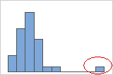
On a histogram, isolated bars at either ends of the graph identify possible outliers.
Try to identify the cause of any outliers. Correct any data–entry errors or measurement errors. Consider removing data values for abnormal, one-time events (also called special causes). Then, repeat the analysis. For more information, go to Identifying outliers.
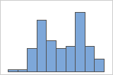
- Multi-modal data
-
Multi-modal data have multiple peaks, also called modes. Multi-modal data often indicate that important variables are not yet accounted for.
Simple
With Groups
For example, a manager at a bank collects wait time data and creates a simple histogram. The histogram appears to have two peaks. After further investigation, the manager determines that the wait times for customers who are cashing checks is shorter than the wait time for customers who are applying for home equity loans. The manager adds a group variable for customer task, and then creates a histogram with groups.
If you have additional information that allows you to classify the observations into groups, you can create a group variable with this information. Then, you can create the graph with groups to determine whether the group variable accounts for the peaks in the data.
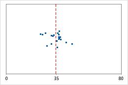
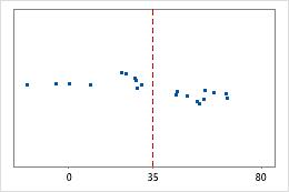
Individual value plot
An individual value plot displays the individual values in the sample. Each circle represents one observation. An individual value plot is especially useful when you have relatively few observations and when you also need to assess the effect of each observation.
Interpretation
Use an individual value plot to examine the spread of the data and to identify any potential outliers. Individual value plots are best when the sample size is less than 50.
- Skewed data
-
Examine the spread of your data to determine whether your data appear to be skewed. When data are skewed, the majority of the data are located on the high or low side of the graph. Often, skewness is easiest to detect with a histogram or boxplot.
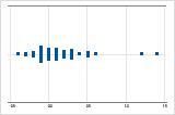
Right-skewed
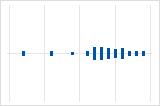
Left-skewed
The individual value plot with right-skewed data shows wait times. Most of the wait times are relatively short, and only a few wait times are long. The individual value plot with left-skewed data shows failure time data. A few items fail immediately, and many more items fail later.
- Outliers
-
Outliers, which are data values that are far away from other data values, can strongly affect the results of your analysis. Often, outliers are easiest to identify on a boxplot.
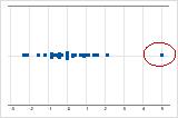
On an individual value plot, unusually low or high data values indicate possible outliers.
Try to identify the cause of any outliers. Correct any data–entry errors or measurement errors. Consider removing data values for abnormal, one-time events (also called special causes). Then, repeat the analysis. For more information, go to Identifying outliers.
Q1
Quartiles are the three values–the first quartile at 25% (Q1), the second quartile at 50% (Q2 or median), and the third quartile at 75% (Q3)–that divide a sample of ordered data into four equal parts.
The first quartile is the 25th percentile and indicates that 25% of the data are less than or equal to this value.
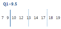
For this ordered data, the first quartile (Q1) is 9.5. That is, 25% of the data are less than or equal to 9.5.
IQR
The interquartile range (IQR) is the distance between the first quartile (Q1) and the third quartile (Q3). 50% of the data are within this range.
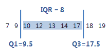
For this ordered data, the interquartile range is 8 (17.5–9.5 = 8). That is, the middle 50% of the data is between 9.5 and 17.5.
Interpretation
Use the interquartile range to describe the spread of the data. As the spread of the data increases, the IQR becomes larger.
Maximum
The maximum is the largest data value.
In these data, the maximum is 19.
| 13 | 17 | 18 | 19 | 12 | 10 | 7 | 9 | 14 |
Interpretation
Use the maximum to identify a possible outlier or a data-entry error. One of the simplest ways to assess the spread of your data is to compare the minimum and maximum. If the maximum value is very high, even when you consider the center, the spread, and the shape of the data, investigate the cause of the extreme value.
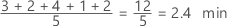
Median
The median is the midpoint of the data set. This midpoint value is the point at which half the observations are above the value and half the observations are below the value. The median is determined by ranking the observations and finding the observation that are at the number [N + 1] / 2 in the ranked order. If the number of observations are even, then the median is the average value of the observations that are ranked at numbers N / 2 and [N / 2] + 1.
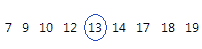
For this ordered data, the median is 13. That is, half the values are less than or equal to 13, and half the values are greater than or equal to 13. If you add another observation equal to 20, the median is 13.5, which is the average between 5th observation (13) and the 6th observation (14).
Interpretation
Symmetric
Not symmetric
For the symmetric distribution, the mean (blue line) and median (orange line) are so similar that you can't easily see both lines. But the non-symmetric distribution is skewed to the right.
Minimum
The minimum is the smallest data value.
In these data, the minimum is 7.
| 13 | 17 | 18 | 19 | 12 | 10 | 7 | 9 | 14 |
Interpretation
Use the minimum to identify a possible outlier or a data-entry error. One of the simplest ways to assess the spread of your data is to compare the minimum and maximum. If the minimum value is very low, even when you consider the center, the spread, and the shape of the data, investigate the cause of the extreme value.
Range
The range is the difference between the largest and smallest data values in the sample. The range represents the interval that contains all the data values.
Interpretation
Use the range to understand the amount of dispersion in the data. A large range value indicates greater dispersion in the data. A small range value indicates that there is less dispersion in the data. Because the range is calculated using only two data values, it is more useful with small data sets.
Q3
Quartiles are the three values–the first quartile at 25% (Q1), the second quartile at 50% (Q2 or median), and the third quartile at 75% (Q3)–that divide a sample of ordered data into four equal parts.
The third quartile is the 75th percentile and indicates that 75% of the data are less than or equal to this value.
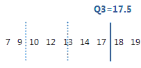
For this ordered data, the third quartile (Q3) is 17.5. That is, 75% of the data are less than or equal to 17.5.
Mean
The mean is the average of the data, which is the sum of all the observations divided by the number of observations.
Interpretation
Use the mean to describe the sample with a single value that represents the center of the data. Many statistical analyses use the mean as a standard measure of the center of the distribution of the data.
Symmetric
Not symmetric
For the symmetric distribution, the mean (blue line) and median (orange line) are so similar that you can't easily see both lines. But the non-symmetric distribution is skewed to the right.
SE mean
The standard error of the mean (SE Mean) estimates the variability between sample means that you would obtain if you took repeated samples from the same population. Whereas the standard error of the mean estimates the variability between samples, the standard deviation measures the variability within a single sample.
For example, you have a mean delivery time of 3.80 days, with a standard deviation of 1.43 days, from a random sample of 312 delivery times. These numbers yield a standard error of the mean of 0.08 days (1.43 divided by the square root of 312). If you took multiple random samples of the same size, from the same population, the standard deviation of those different sample means would be around 0.08 days.
Interpretation
Use the standard error of the mean to determine how precisely the sample mean estimates the population mean.
A smaller value of the standard error of the mean indicates a more precise estimate of the population mean. Usually, a larger standard deviation results in a larger standard error of the mean and a less precise estimate of the population mean. A larger sample size results in a smaller standard error of the mean and a more precise estimate of the population mean.
Minitab uses the standard error of the mean to calculate the confidence interval.
TrMean
The mean of the data, without the highest 5% and lowest 5% of the values.
Use the trimmed mean to eliminate the impact of very large or very small values on the mean. When the data contain outliers, the trimmed mean may be a better measure of central tendency than the mean.
CumN
| Grade Level | Count | CumN | Calculation |
|---|---|---|---|
| 1 | 49 | 49 | 49 |
| 2 | 58 | 107 | 49 + 58 |
| 3 | 52 | 159 | 49 + 58 + 52 |
| 4 | 60 | 219 | 49 + 58 + 52 + 60 |
| 5 | 48 | 267 | 49 + 58 + 52 + 60 + 48 |
| 6 | 55 | 322 | 49 + 58 + 52 + 60 + 48 + 55 |
N*
The number of missing values in the sample. The number of missing values refers to cells that contain the missing value symbol *.
| Total count | N | N* |
|---|---|---|
| 149 | 141 | 8 |
N
The number of non-missing values in the sample.
| Total count | N | N* |
|---|---|---|
| 149 | 141 | 8 |
Total Count
The total number of observations in the column. Use to represent the sum of N missing and N nonmissing.
| Total count | N | N* |
|---|---|---|
| 149 | 141 | 8 |
CumPct
The cumulative percent is the cumulative sum of the percentages for each group of the By variable. In the following example, the by variable has 4 groups: Line 1, Line 2, Line 3, and Line 4.
| Group (by variable) | Percent | CumPct |
|---|---|---|
| Line 1 | 16 | 16 |
| Line 2 | 20 | 36 |
| Line 3 | 36 | 72 |
| Line 4 | 28 | 100 |
Percent
The percent of observations in each group of the By variable. In the following example, there are four groups: Line 1, Line 2, Line 3, and Line 4.
| Group (by variable) | Percent |
|---|---|
| Line 1 | 16 |
| Line 2 | 20 |
| Line 3 | 36 |
| Line 4 | 28 |
Kurtosis
Kurtosis indicates how the tails of a distribution differ from the normal distribution.
Interpretation
Baseline: Kurtosis value of 0
Normally distributed data establish the baseline for kurtosis. A kurtosis value of 0 indicates that the data follow the normal distribution perfectly. A kurtosis value that significantly deviates from 0 may indicate that the data are not normally distributed.
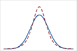
Positive kurtosis
A distribution that has a positive kurtosis value indicates that the distribution has heavier tails than the normal distribution. For example, data that follow a t-distribution have a positive kurtosis value. The solid line shows the normal distribution, and the dotted line shows a distribution that has a positive kurtosis value.
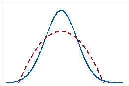
Negative kurtosis
A distribution with a negative kurtosis value indicates that the distribution has lighter tails than the normal distribution. For example, data that follow a beta distribution with first and second shape parameters equal to 2 have a negative kurtosis value. The solid line shows the normal distribution and the dotted line shows a distribution that has a negative kurtosis value.
Skewness
Skewness is the extent to which the data are not symmetrical.
Interpretation
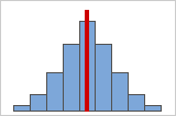
Figure A
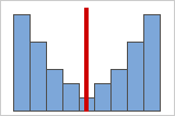
Figure B
Symmetrical or non-skewed distributions
As data becomes more symmetrical, its skewness value approaches zero. Figure A shows normally distributed data, which by definition exhibits relatively little skewness. By drawing a line down the middle of this histogram of normal data it's easy to see that the two sides mirror one another. But lack of skewness alone doesn't imply normality. Figure B shows a distribution where the two sides still mirror one another, though the data is far from normally distributed.
Positive or right skewed distributions
Positive skewed or right skewed data is so named because the "tail" of the distribution points to the right, and because its skewness value will be greater than 0 (or positive). Salary data is often skewed in this manner: many employees in a company make relatively little, while increasingly few people make very high salaries.
Negative or left skewed distributions
Left skewed or negative skewed data is so named because the "tail" of the distribution points to the left, and because it produces a negative skewness value. Failure rate data is often left skewed. Consider light bulbs: very few will burn out right away, the vast majority lasting for quite a long time.
CoefVar
The coefficient of variation (CoefVar) is a measure of spread that describes the variation in the data relative to the mean. The coefficient of variation is adjusted so that the values are on a unitless scale. Because of this adjustment, you can use the coefficient of variation instead of the standard deviation to compare the variation in data that have different units or that have very different means.
Interpretation
The larger the coefficient of variation, the greater the spread in the data.
| Large container | Small container |
|---|---|
| CoefVar = 100 * 0.4 cups / 16 cups = 2.5 | CoefVar = 100 * 0.08 cups / 1 cup = 8 |
StDev
The standard deviation is the most common measure of dispersion, or how spread out the data are about the mean. The symbol σ (sigma) is often used to represent the standard deviation of a population, while s is used to represent the standard deviation of a sample. Variation that is random or natural to a process is often referred to as noise.
Because the standard deviation is in the same units as the data, it is usually easier to interpret than the variance.
Interpretation
Use the standard deviation to determine how spread out the data are from the mean. A higher standard deviation value indicates greater spread in the data. A good rule of thumb for a normal distribution is that approximately 68% of the values fall within one standard deviation of the mean, 95% of the values fall within two standard deviations, and 99.7% of the values fall within three standard deviations.
Hospital 1
Hospital 2
Hospital discharge times
Administrators track the discharge time for patients who are treated in the emergency departments of two hospitals. Although the average discharge times are about the same (35 minutes), the standard deviations are significantly different. The standard deviation for hospital 1 is about 6. On average, a patient's discharge time deviates from the mean (dashed line) by about 6 minutes. The standard deviation for hospital 2 is about 20. On average, a patient's discharge time deviates from the mean (dashed line) by about 20 minutes.
Variance
The variance measures how spread out the data are about their mean. The variance is equal to the standard deviation squared.
Interpretation
The greater the variance, the greater the spread in the data.
Because variance (σ2) is a squared quantity, its units are also squared, which may make the variance difficult to use in practice. The standard deviation is usually easier to interpret because it's in the same units as the data. For example, a sample of waiting times at a bus stop may have a mean of 15 minutes and a variance of 9 minutes2. Because the variance is not in the same units as the data, the variance is often displayed with its square root, the standard deviation. A variance of 9 minutes2 is equivalent to a standard deviation of 3 minutes.
Mode
The mode is the value that occurs most frequently in a set of observations. Minitab also displays how many data points equal the mode.
The mean and median require a calculation, but the mode is determined by counting the number of times each value occurs in a data set.
Interpretation
The mode can be used with mean and median to provide an overall characterization of your data distribution. The mode can also be used to identify problems in your data.
For example, a distribution that has more than one mode may identify that your sample includes data from two populations. If the data contain two modes, the distribution is bimodal. If the data contain more than two modes, the distribution is multi-modal.
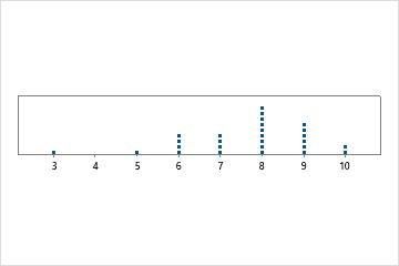
Unimodal
There is only one mode, 8, that occurs most frequently.
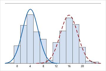
Bimodal
There are two modes, 4 and 16. The data seem to represent 2 different populations.
MSSD
The MSSD is the mean of the squared successive difference. MSSD is an estimate of variance. One possible use of the MSSD is to test whether a sequence of observations is random. In quality control, a possible use of MSSD is to estimate the variance when the subgroup size = 1.
Sum
The sum is the total of all the data values. The sum is also used in statistical calculations, such as the mean and standard deviation.
Sum of Squares
The uncorrected sum of squares are calculated by squaring each value in the column, and calculates the sum of those squared values. For example, if the column contains x1, x2, ... , xn, then sum of squares calculates (x12 + x22 + ... + xn2). Unlike the corrected sum of squares, the uncorrected sum of squares includes error. The data values are squared without first subtracting the mean.