In This Topic
About groups
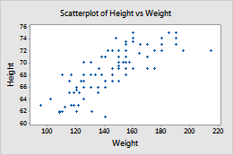
You can represent different groups on a graph so that you can easily compare groups. For example, you can create a scatterplot of Weight vs. Height for women and Weight vs. Height for men.
Minitab offers several ways to display groups on your graph; however, not all the options are available for all graphs or worksheet arrangements.
Groups are overlaid on the same graph
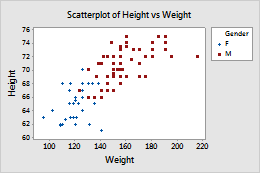
Overlaid groups are effective when you have relatively few categorical levels, or if relatively small differences are visible if the groups share the same graph.
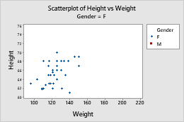
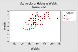
Scatterplot with symbols
- Double-click the graph.
- Double-click a symbol. (For more information, go to Select groups and single items on a graph.)
- On the Groups tab, in Categorical variables for grouping, enter Gender.
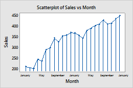
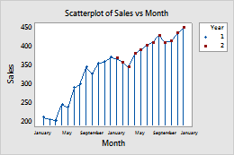
Scatterplots with other data displays
- Double-click the graph.
- Double-click a symbol. (For more information, go to Select groups and single items on a graph.)
- On the Groups tab, in Categorical variables for grouping, enter Year.
- Check Apply same grouping to other data displays to use the same grouping variables for all data display elements.
If you edit the symbols to add Year as a grouping variable and do not select Apply same grouping to other data displays, only the symbols show the groups. If you select this option, then the groups are applied to all of the data display elements.
Not selected
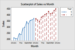
Selected
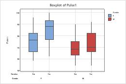
Boxplots with groups
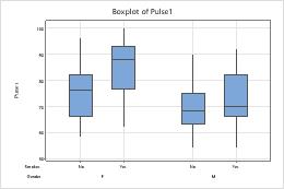
- Double-click the graph.
- Double-click a box to open the Edit Interquartile Range Box dialog box. (For more information, go to Select groups and single items on a graph.)
- On the Groups tab. in Assign attributes by categorical variables, enter Gender.
Boxplots with additional data displays
The steps below describe how to different attributes to a grouping variable in a boxplot, which contains interquartile range (IQR) boxes and range boxes.
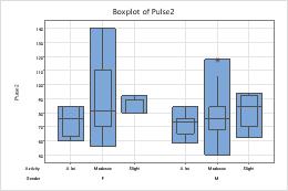
- Double-click the graph.
- Double-click a box to open the Edit Interquartile Range Box dialog box. (For more information, go to Select groups and single items on a graph.)
- On the Groups tab, in Assign attributes by categorical variables, enter Activity.
- Check Apply same grouping to other data displays to use the same grouping variables for all data display elements.
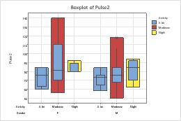
Not selected
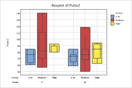
Selected
Groups are in separate panels of the same graph
Paneling can be effective, for example, when you want to show the distinction between many categorical levels, or when data displays overlap (as with histograms).
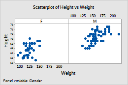
- Right-click the graph and choose Panel.
- In By variables with groups in separate panels, enter a variable to specify the panels.
Groups are on separate graphs
Display each group on a separate graph when you want to examine one group at a time.
- In the graph creation dialog box, click Multiple Graphs.
- Do one of the following:
- If you have unstacked data, click the Multiple Variables tab and choose On separate graphs.
- If you have stacked data, click the By Variables tab and enter a grouping variable for groups on separate graphs.