In This Topic
Step 1: Determine whether the data do not follow the distribution
- P-value ≤ α: The data do not follow the distribution (Reject H0)
- If the p-value is less than or equal to the significance level, the decision is to reject the null hypothesis and conclude that your data do not follow the distribution.
- P-value > α: Cannot conclude the data do not follow the distribution (Fail to reject H0)
- If the p-value is larger than the significance level, the decision is to fail to reject the null hypothesis because you do not have enough evidence to conclude that your data do not follow the distribution. However, you cannot conclude that the data do follow the distribution.
For information on how to specify different distributions and parameters for the test, go to Fitted distribution lines.
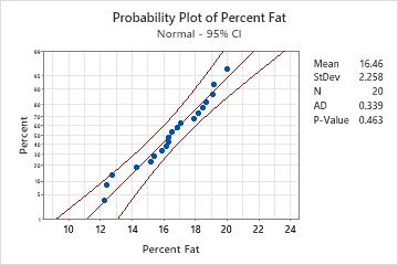
Key Results: P-Value
In these results, the null hypothesis states that the data follow a normal distribution. Because the p-value is 0.463, which is greater than the significance level of 0.05, the decision is to fail to reject the null hypothesis. You cannot conclude that the data do not follow a normal distribution.
CAUTION
Sample size affects the power of the test. Extremely small samples may have inadequate power to detect significant departures from the distribution. Extremely large samples may have excessive power to detect small, inconsequential departures from the distribution. Therefore, use the visual results on the probability plot as well as the p-values to assess the distribution fit, as shown in Step 2.
Step 2: Visualize the fit of the distribution
Examine the probability plot and assess how closely the data points follow the fitted distribution line. If the specified theoretical distribution is a good fit, the points fall closely along the straight line. For example, the points in the following normal probability plot follow the fitted line well. The normal distribution appears to be a good fit to the data.
Note
The fitted distribution line is the straight middle line on the plot. The outer solid lines on the plot are confidence intervals for the individual percentiles, not for the distribution as a whole, and should not be used to assess distribution fit.
For more information on visually assessing the values on the probability plot, go to Normal probability plots and the "fat pencil test".
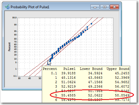
Step 3: Display estimated percentiles for the population
In Minitab, hold your pointer over the fitted distribution line to see a table of percentiles and values.
For example, the following probability plot shows the pulse rates of test subjects as they walked on a treadmill. For a normal distribution with a mean and standard deviation equal to the data, we would expect 5% of the population to have a pulse rate of 54.76 or less.
Note
The estimated population percentiles are accurate only if the data follow the distribution closely.