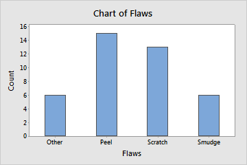
A quality engineer for an automotive supply company wants to decrease the number of car door panels that are rejected because of paint flaws. As part of the initial investigation, the engineer creates a bar chart to compare the counts of paint flaws.
- Open the sample data, PaintFlaws.MWX.
- Choose .
- In Categorical variables, enter Flaws.
- Click OK.
Interpret the results
This bar chart shows that Peel is the most common paint flaw and that Smudge and Other are the least common paint flaws.